Basically the same question as this one here from 2020.
I want a basic dashboard with one filter (dropdown) and two visualizations (table and bar chart) to consume that filter. I’ve searched for hours and found nothing. I do NOT want a sunburst chart!
@cdruf_iu you can see an example with the use of the refresh button and graphics here:
There is a video to explain what is going on. You might be interested in the part about the interactive node at the end of the part.
Also this blog might be interesting.
I will have to see if I can come up with a condensed example. Do you have and examples of what you want to display. Maybe using publicly available data?
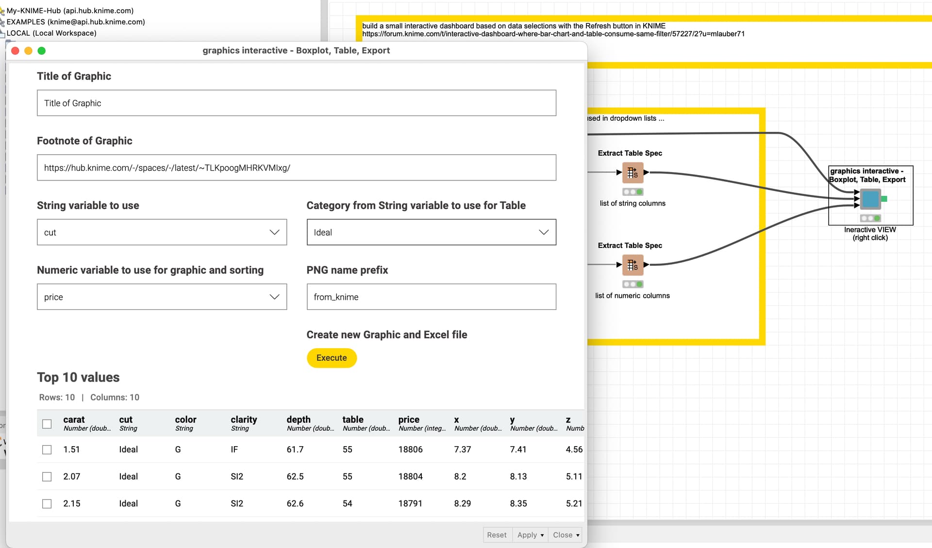
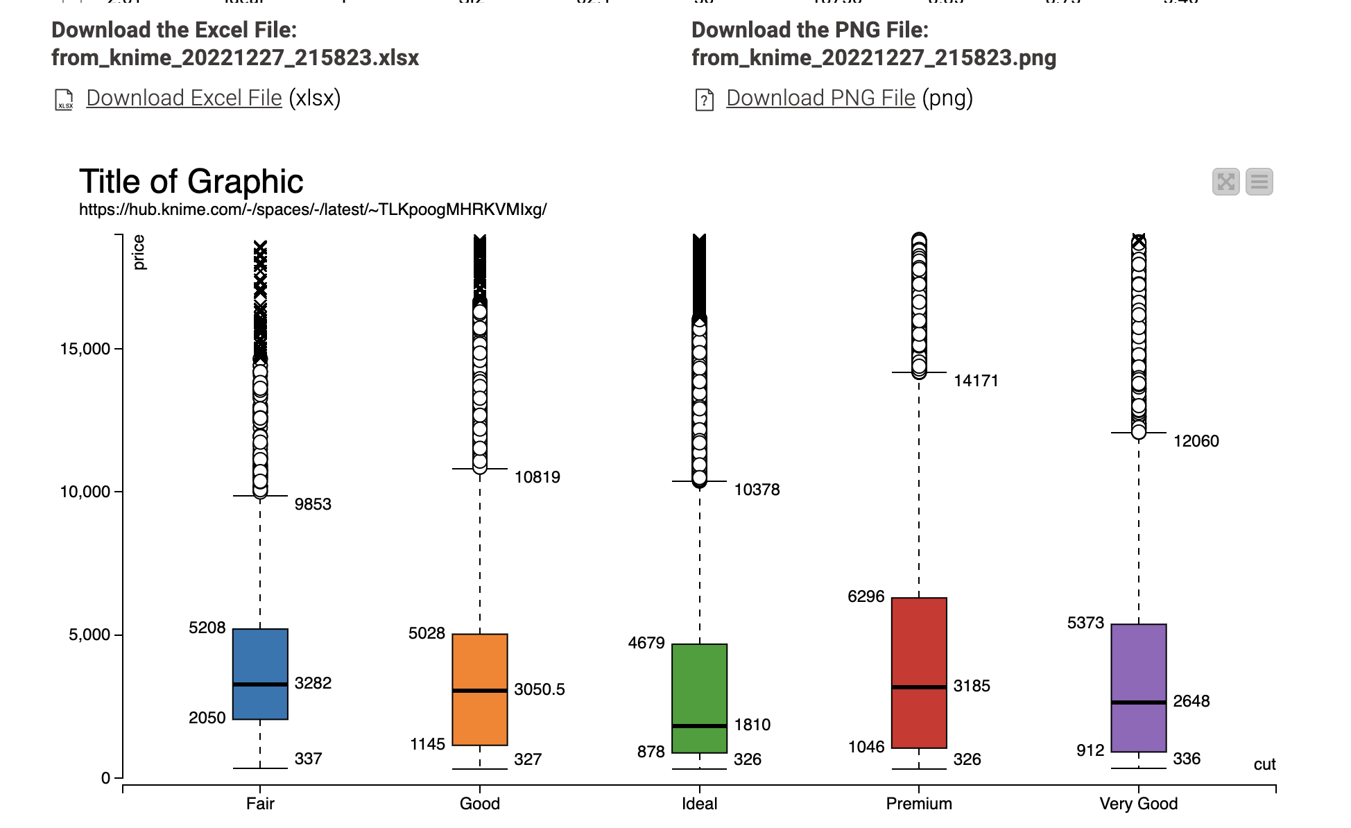
@cdruf_iu here is an example of a dashboard where you could select a string variable and a numeric variable which then will be displayed in a Boxplot.
Also you could select one category from the string variable and sort the rows by the numeric variable descending. Also you can download the graphic as a PNG file with an individual name.
I really appreciate your effort here! It seems like the dashboard you have built updates after clicking on the button, and that the way you do it basically works for any visualization since you are generating new images, whenever the button is clicked.
It’s not perfectly dynamic, but the solution would certainly serve my purpose.
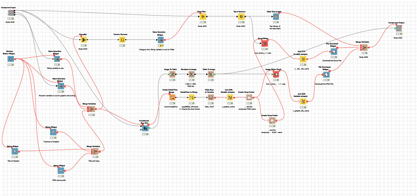
However, the workflow consists of approximately 20 nodes. I’m adding a screenshot to illustrate. This complexity for a task that can be done with few clicks in other tools. If it’s that cumbersome, I’m using other tools for visualization.
@cdruf_iu you could try the new knime nodes that would allow for more interactive features. Question is if this would allow for your use case.
The dashboards are very flexible and allow for the combination of many knime features. Many firms combine knime with other dashboarding tools like Tableau, MicroStrategy or Power BI. So to keep the data preparation and dashboard functions separate.