Hi. I am looking to create a line plot with interactive filters. I want it to be very similar to one I made in using Excel’s Pivot Chart tools. I uploaded a picture below for reference
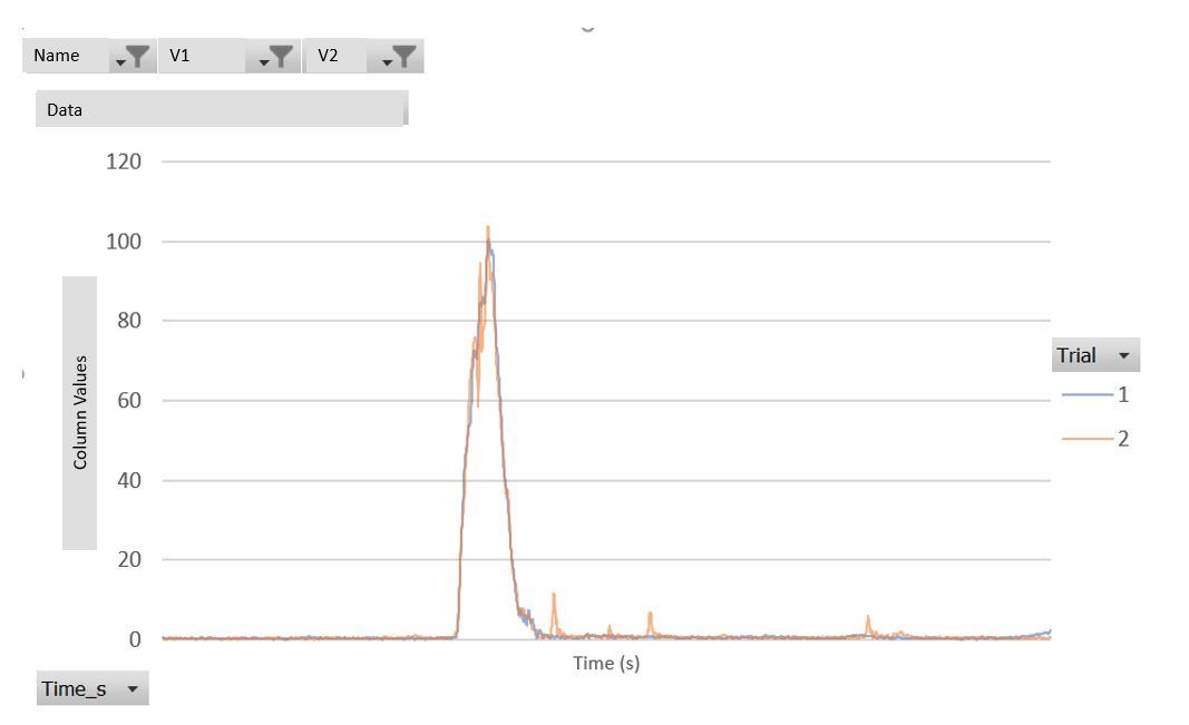
My dataset has 4 variable columns (Name, V1, V2, and Trial). And each variable combination has several rows that make up the time series.
I want to be able to filter Name, V1 and V2. Then, have the plot show multiple lines representing the Trial values within that filter.
How can I achieve this?