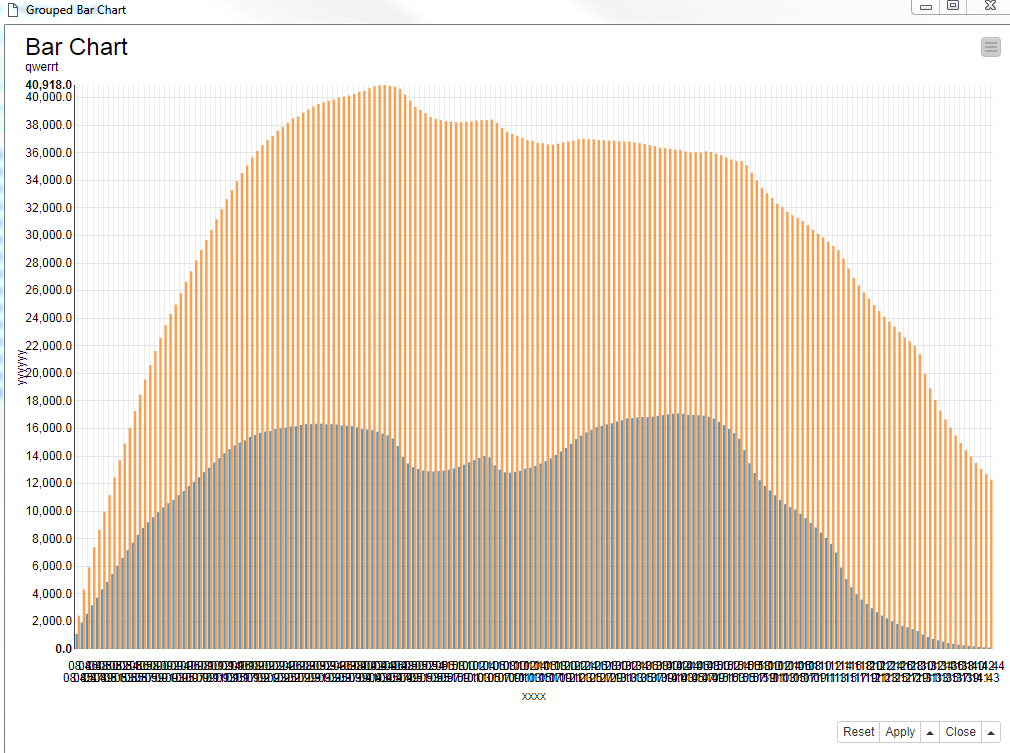
Is it possible to add some custom intelligence to how X labels are displayed?
The following attachment shows how the easily overlap.
Thanks.
I think that with the JavaScript Bar Chart node, your options are limited with that many labels on the X-axis. There is an option to Stagger Labels, but that won’t help you in this case.
Depending on what you’re trying to plot, it might be more practical to try a line plot instead of the bar chart. Apart from that, if you’re good with Javascript, you could try some customizations using the Generic JavaScript View node.
I see your point, but staggering does not solve the issue because of the so many values on the x axis.
I just wanted to perform a quick presales demo, no time enough to code Javascript.
As an idea, maybe you could provide some Javascript templates or samples (eg. one producing the same as the Bar Chart node) in order to be customised on the user side. Just a suggestion.
1 Like