KNIME Analytics Platform Version 5 Early Access Release Feedback

Dear all,

thank you very much for this nice preview…

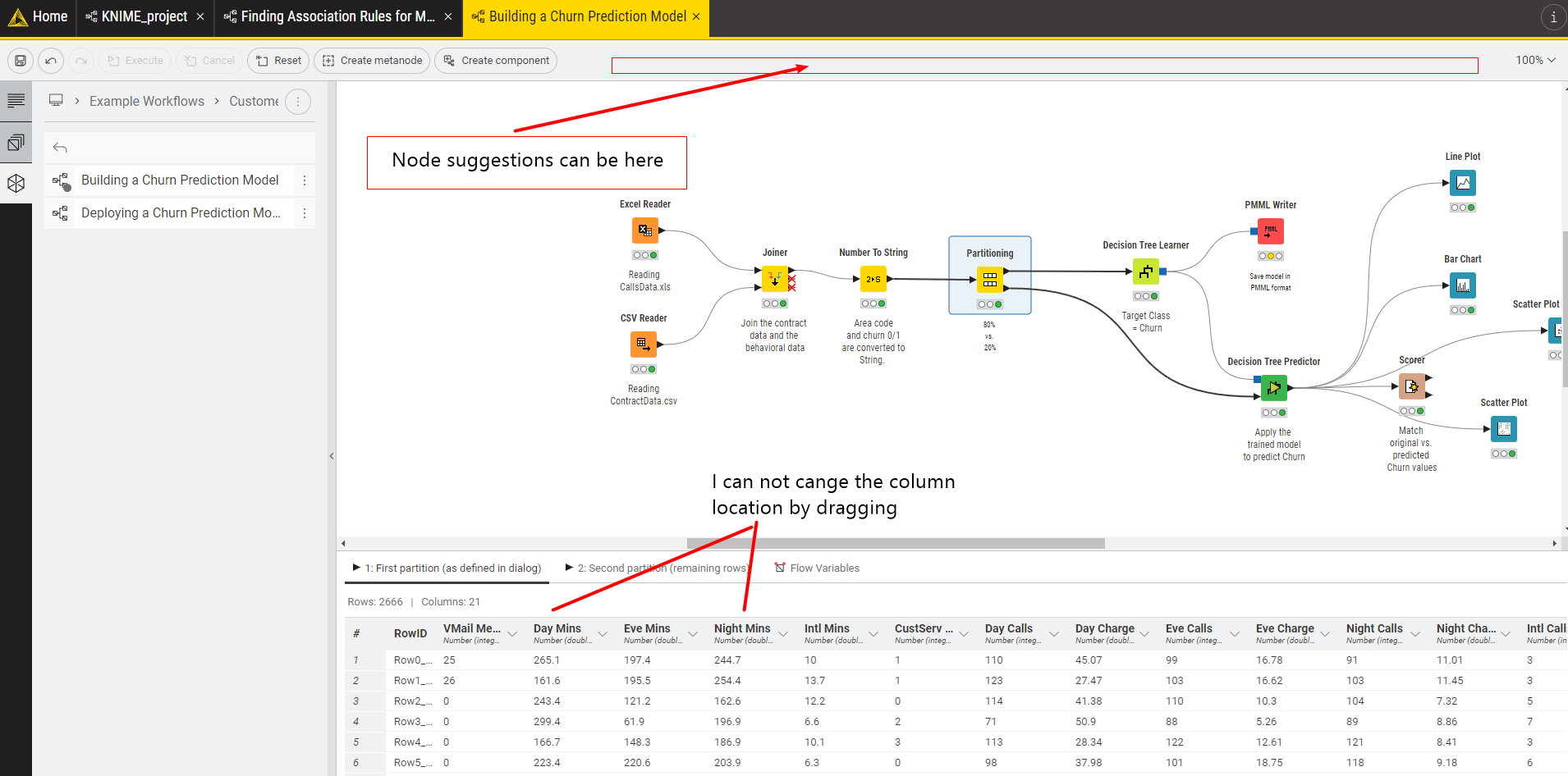
I am working just on a laptop without an external monitor. So space on the desktop is very limited…

Having this in mind I have two remarks:
It would be great to open the output table as a modal with a right click, as there is always space reserved for showing the data table output (plus the flow variables). I would prefer to have this space for the workflow.

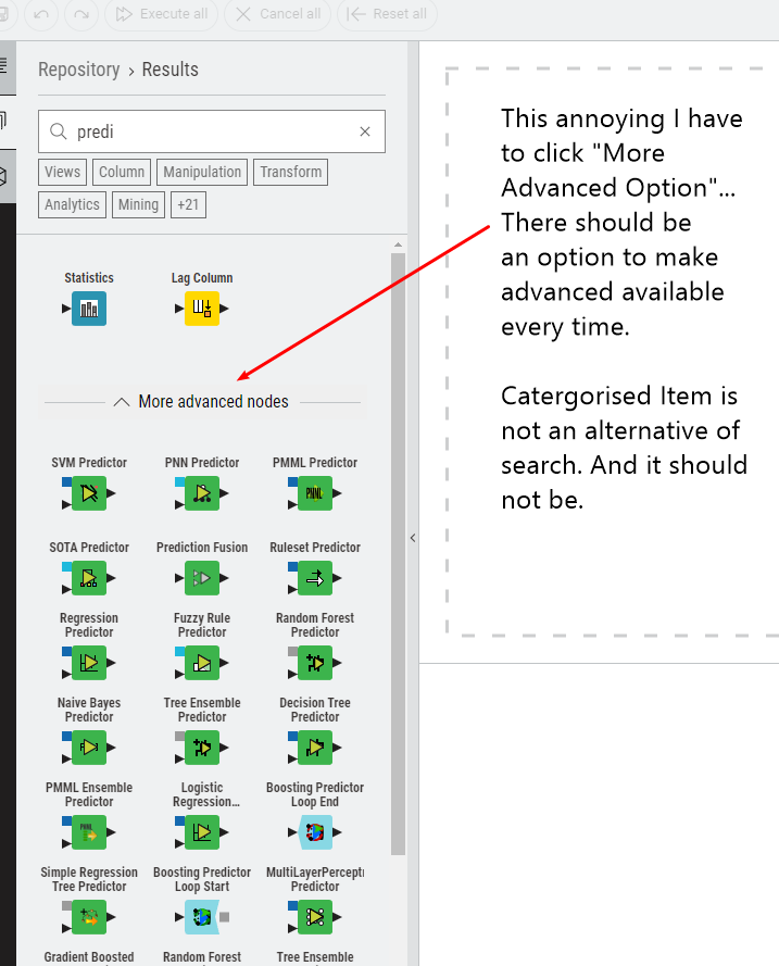
Secondly I am quite often using the search option to find the right node. If I type “db reader” I would expect to find the DB Reader node and perhaps two or three other nodes, but not a very long list of nodes (e.g. like the “DB Table Remover” node). So the search should be more “exact” (obviously it’s my personal view).
If the starter nodes are set (through the GUI settings), the “right” node is in the advanced node section.
This has another disadvantage (one again linked to my limited desktop space)… you have to scroll through “many” nodes. Here I would suggest to collapse the starter node if the advance node section is selected (and vice versa).

Once again thank you very much for your constant effort to improve KNIME and its usability. For me it is one of the best tools to get insights in (engineering) data without being a coding professional.

Best regards,

Jürgen

Love Knime #knime-analytics-platform

Few Recommendations :

  1. The new UI resolved all the spacing problem, still in advanced section there is an option could be
    there to relocate to right or left etc. Few freedom is not bad.
  2. All the nodes and nodes designs are modernised, but “Configure” menu is not modernised. Nodes
    are now so sexy, that “Configure” UI is still “Old Days”. Please do something.
  3. View icon revolutionary. Love it ! But what about a “dashboard tab” for advanced user, there may be
    an option to automatically send all the visuals and scoring output can be set to a “Limited Edition”
    dashboard, Not recquired to replace the Power BI, Just to share the work to shareholders
    quickly just executing “Executing all” and “Updated to Built in Dashboard”. I know Knime develpers
    are highly creative and visionery to make a simple advancement.
  4. There needs the PMML export for H20 AutoML. I gurantee the H20 autoML is game changer for
    unbratable accuracy. But I can not transfer the learning in PMML from h20. Isnt it little bit frustating.
  5. We need Knime limited edtions online collboration for direct execution with limited capability (for
    free user like tableau online version). I bet Knime will the game changer then.

  1. Also in the left black section there can be an option for bookmarking favorite nodes.

  2. Plot execution can be displayed in bottom “file table” section for plot view.

  3. Keras or tensor flow can be bundled with latest python for avoiding integration error or provide
    standalone installation for quick rinstallation.

2 Likes

Using the column rename to change the variable type always was risky so maybe it is best to have this in separate columns.

1 Like

I like the new look and feel.
But I really would have the list view option in the node repository. Or at least much smaller icons.
Is there a way to disable the “table view” in the Node View Pane? My tables get quite big and it always produces a delay when I click on the node icon.

2 Likes

When reviewing the table output of a node, I used to be able to press Ctrl + F to look for a keyword or keyphrase. Now, I need to scroll all the way to the right to find the Search box.

I hope that Ctrl + F can automatically bring the focus to the Search box and enable me to type my keyword/keyphrase right away.

Great job on KNIME 5 so far!

that would be great. Currently both 4.7.x and 5.0 are not usable on a Apple Silicon machine unfortunately - the intel versions though do work.

One thing I notice (with the 5.0 intel version on an M1 Mac) is that if you scroll a large white area seems to open up to the top and left. I would have expected existing workflows to somehow be ‘anchored’ at the edge and to expand to the right and down.

1 Like

I didnt know that Knime has a “Report Designer”, But why this such wonderful stuffs are not installed as default. Any way I am not sure it capable for user interaction and can be used as front end development in an organisation !!! Why not we thinking unified ? Why not we are incorporating DASH or PLOTLY use as tight integration for reporting or “Dashboard tool” , so that it can be also used for all kinds of user interaction and shared to other for software development. I recquest to Knime developer to think about the future adoption and “Thinking END to END” for developers for software engineering deployment in production. You can ask subscription for that specific portion of engineering/development Plugins/Extension etc. As Knime Practitioner, Learning and Promoting Knime is also one kind of investment for us (User).

Have you seen the Table Manipulator node? It’s relatively new but is pretty much what you describe.

2 Likes

Dear Scott, The string to date is so blind that it can not detect multiple date format in a table or within a column, Whereas excel can do that. So in case I have some unstructured date format, I stuck there, & I have to use excel. I think there is some bach and more custom smart option is recquired to do complex date manipulation.

Simple question is really important one. I have removed the previous KNIME version to install the new one what was unnecessary. I would suggest to update info on Early Access: KNIME Analytics Platform Version 5 | KNIME page to inform about possibility of having two KNIME versions on the same machine

On Mac, I tried double clicking the line between columns on the data preview table at the bottom and instead of auto-resizing like Excel, it made my mouse cursor stick on that resizer. I had to close and come back to KNIME to remove the stickiness.

It would be great if double clicking the line between columns triggers an auto-resize like Excel.

Thanks for all the great works!

The current Modern UI Node Repository approach is a serious step backwards when it comes to functionality. I really don’t get the overall UI approach when you factor in the unique platform requirement of users potentially navigating / searching through thousands of nodes…

Problems:

The node icons are huge, so you can only see a few at a time without endlessly scrolling.

The default “by category” view adds to the massive waste of space issues, requires extra clicks to see most of those nodes, and doesn’t work in combination with a search.

The ability to remove the “by category” separation requires multiple clicks, isn’t intuitive and is easily lost.

There seems to be no way to perform a node search, select the top result and then add it to the workflow via keyboard. Whatever the default node repository view is, it should handle a simple search / select / apply approach.

A few recommendations that would help:

Variable node icon / text size / spacing controls to reduce the spacing issues and allow users to optimize for monitor size / pixels.

Viewing nodes “by category” should be done by filter, never as a default organization of nodes

Category names could also be shown in a popup upon mouse hover to avoid clutter

Search results should not be displayed “by category”, but by search results as the default

Let users drag around nodes in the default view to permanently customize the default order of nodes to their preference (this would regain some of the functionality of the favorites nodes without the additional window)

Ensure that the entire node search / selection / apply process is keyboard accessible.

A few others:

I would also like to add my name to the list of needing the option to open components in a new window. The expand component approach simply doesn’t work with larger cluttered workflows.

Platform Settings should be easier to find with a settings icon at the top right or bottom left. I am assuming that more settings for customization and keyboard shortcuts are in the works.

Also, what is the keyboard shortcut for zoom in? Zoom out is working, but not zoom in…

I love that we will finally have the ability to copy values out of the Node Monitor window! It would be amazing if we could see the input table in the Node Monitor while we are configuring a node. Of course we would have to be able to access that window to copy values instead of being locked into the config windows…

10 Likes

Hey @atiorile,
can you reproduce this issue? I just tried it and it seems that I cannot reproduce the problem. I agree that it would be nice to resize the columns on double click and we already looking into this.

Greetings,
Daniel

Hi @DanielBog,

Here is the link to my screen recording demonstrating the stickiness after a double click: Double Click Resize Stickiness - YouTube

I tried to auto-resize the SJU 1998 column by double clicking, but then my mouse cursor got stuck there, and due to the stickiness, I then had trouble resizing SJU 1983 column just by dragging.

My Mac is a MacBook Pro (13-inch, 2020, Two Thunderbolt 3 ports). It’s on macOS Monterey version 12.6.3.

It would be ideal if the double click can auto-resize and lose its stickiness.

I have to agree with iCFO.

The new UI design does not only have advantages.
I guess for “small workflows” that fit on one screen without many metanodes/components, it is a nice thing. But overall, at least for now, functionality suffered a bit much.

Opening metanodes/components in an additional window needs to be possible.
Searching for nodes via name was pretty convenient for me - if I actually have a name match. Now it’s more about a functionality match?
Having many columns with the new UI is pretty painful. But that goes for all newer nodes.
The current (4.6.3 for me) Rule Engine/math/string manipulation etc. for example: I can make the settings window larger if I need to and can easily access all column names on the top left by scrolling through them and double-click or click+enter them when I need to. Compared to the current Column Expressions - click column and always scroll through a tiny window which only shows me 5 columns at once…that is not convenient. Similar for the Column Rename vs. Column Renamer.

I guess for beginners the new UI is a good way to start.
For knime oldtimers with “crazy” workflows that are not “presentation material” the old UI offers more functionality, esp. for Views. The new Views are better looking, the preview in the configuration window is great - but all additional options (via flow variables) are gone, unless that changed in the meantime.

Regarding performance: I am testing 5.0 just on my laptop (not that old), but just dropping a new node in the new UI takes 3-5 longer until it appears compared to the classic UI. I guess there are some tweaks coming? I was testing it in a pretty big workflow with a few hundred nodes and about a dozen metanodes, not a blank/new one.

Some nodes are a bit confusing to me; maybe I just don’t see the point yet:
Row aggregator vs. groupby: there is a grand total which does not exist for groupby, but other than that isn’t it just a mini version of groupby with limited functionality.
Numeric/Nominal value row filter/splitter…in the past, I guess most of us used a rule-based approach when it got more complicated that a single value/range.
Personally, I prefer a broader approach, like rule-based, which can be used with very simple but also very complicated rules instead of adding nodes and nodes for each special simple case.

Is there maybe a way to blacklist nodes, so that they never appear when searching?
There are more and more nodes that essentially do the same. 1 node that can do everything and 5 more nodes, each for special/easy cases (…personally, I don’t need/want to see those 5 nodes).

in short: Please don’t sacrifice too much (any if possible) functionality in favor of simplicity or design.
Knime is more than just a tool for entry level users in any field and it is totally fine to expect a certain knowledge from the users (i.e. new DB nodes: in my opinion it is fine, even necessary, to expect people to write/kow SQL code when querying a database, instead of selecting/filtering/joining everything with lots of nodes).
Currently, it seems, that knime is going into a direction like: Tool for everyone/every field, but with limited depths (i.e. additional options previously only accessible via flow variables are gone).
I love knime as the “swiss army knife for data”; if advanced functionalities will only be available via scripting nodes in the future, that would be really sad.

12 Likes

Question: is it possible to save “favorite nodes” in version 5?

Is it no longer possible to drop a new node on top of a connector or other node to replace the old node with the new? Maybe I’m just missing it but can’t seem to drop it on anymore - I liked that feature in previous version.

1 Like