It would be interesting to have the possibility of opening multiple windows instead of having only one view at the bottom of the screen.
4 Likes
Take my one special recquest :
-
Make more focus on “Column Expression”
-
Make the column expression bound with default installation.
Please focus this your most underrated “Node”
5 Likes
Hey @tgoedeke,
thanks for the feedback, there are a lot of good points in your post.
I can only comment on the visualisations and columns part. As for the performance with many columns we are already working on a solution. For the new visualisations you already have the flow variable tab that we always provided. You just have to right click on the view node and click on the ‘open flow variable’ entry. I agree that this is a bit hidden at the moment and we will improve this in the future. Please let me know if you are missing any flow variables in this tab.
Greetings,
Daniel
2 Likes
Hallo, @ScottF
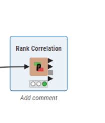
I used rank correlation nodes, but I realized that the node can open view such as Previous versions of Knime.
he doesn’t display the image display of his rank correlation. Is there a way of displaying image views on the results from rank correlation analysis other than a table?
Hi veniapputrii,
you could always rank your values before and then use pearson correlation, that should give you more options for nodes, incl. colorful views.
Ranking via rank node might not give you the desired results, but sorting and taking the average of the row index for each value should ( values 3 ; 3 ; 4 ; 4 ; 4 ; 5 should be ranked 1.5; 1.5 ; 4 ; 4 ; 4 ; 6 )
You need to add the ability to change the default knime-workspace location.
No Group By? The Row Aggregator is too limited.
Put the nodes in a tabbed toolbar. Too much space is used having them on the left.
4 Likes
Knime is already a mature product !!! Dont need to sacrifce any functionality over existing nodes, rather invent a special UI better then alteryx (Not better then Knime, Cause Knime has its own beauty and speciality). Your new UI (Actually the UX) will shape your business and scalability. So take time, and we are much more happy with the existing capabiltiy with the current Knime (4.71)
6 Likes
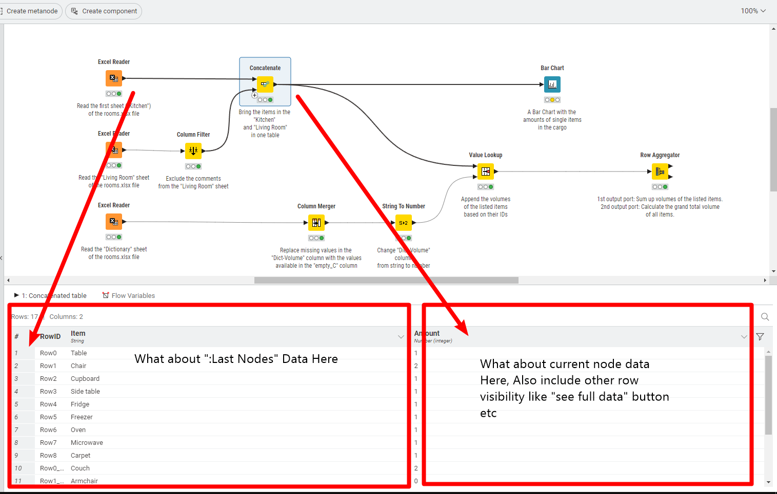
When clicking a node, I can see a table of its results at the bottom.
I wish that the columns can be moved around by dragging like how they are on KNIME 4.7.1.
With the new KNIME 5 UI, I managed to get one more colleague to become interested due to its sleek look & feel. Keep up the great work!
1 Like
On the welcome screen of KNIME 5, after clicking Local space, is it possible to allow the users to search for workflows like how it is possible to do on KNIME 4.7.1? I rely on that feature quite a bit.
1 Like
Can’t install Continental nodes.
Its difficult to assess V.5 since its essentially unusable for me. Sleek look with low/no functionality is pointless. Frankly, I’m perfectly happy with the V. 4.7.1 interface. Knime users would be better served if Knime focused its efforts on technical improvements, e.g. plotting.
- Can’t install any extensions so many of my existing workflows don’t work.
- Can’t open metanodes or components. Only expand seems to be available which is
totally unacceptable. - Nodes should be sorted alphabetically in each group. I realize search is available,
but sorting would really be nice, especially if I’m not sure what I’m searching for. - Dragging a new node onto an existing connector is an important efficiency feature.
Doesn’t seem to be available in V.5.
7 Likes
Another “not really a fan” here. It looks nice and sleek at first glance, but it’s a lot of awkward when working with it. It all feels like a hobby webview app of the 2000s.
- Entire workspace is cluttered and full of tabs with strange icons that are not intuitive. Plus lots of wasted space. Flexibility to place node selection/console/node monitor/documentation/etc anywhere is missing.
- Node selection is a waste of space, too. Nobody needs the “visual” of the node, they’re just boxes identified by title and, perhaps, color. The little pictograms inside node visuals are not important and you seem to waste a lot of time designing those. Also too much clicking and scrolling required, as others noted.
- Pop-outs: I’d like to be able to pop out the data view for each nodes, like it’s possible currently. Just having the “Node Monitor” as a tab somewhere is not ideal.
- Node config dialogs: Again, the new webview config dialogs are wasting a lot of space (compare old and new!!). Plus, again, they look very old-fashioned and hobbyist.
Overall not feeling very comfortable promoting KNIME at my (big, paying) company any more.
7 Likes
first and foremost thanks for the feedback! We don’t intend to remove the classic KNIME Analytics Platform look & feel while we’re still receiving constructive feedback from you. You can go back to the classic look & feel and continue working there if you want ![]()
We are already discussing (and addressing/*) the incoming feedback (thank you again) - that was one of the main points of the “Early Access” version of KNIME Analytics Platform 5 to get our community involved, well, early. Please keep the feedback coming!
Cheers,
Christian
/* Dropping nodes on nodes and connection is in the works. Quick Node Insertion will get a search, too. This might reduce the need to use the node-repository and you can save some space in your editor. And: We’re working on making all Community Extensions available again.
/** @rfeigel we’re also continuing to work on the new visualization nodes (see e.g. KNIME new Visualizations Nodes). Happy to hear your input on that, too of course!
5 Likes
Can the advanced configuration features (Flow Variables, Job Manager Selection, Memory Policy) becomed under a Tab labelled “Advanced”, since these are not used very often by beginning or even intermediate users?
Because users are looking for results, can interactive views and other results be moved nearer to the top of the list on the right-click dropdown?
Hi,
I just recompiled the MOE extensions for Life Science Modelling against 5.0 and ran a few tests.
There are three issues I noticed:
- I cannot install extensions from a zip file in the new UI. I had to switch back to classic view. This is not critical for normal users as allowing them to install “verified” extensions from a server helps keeping an installation clean but for developers to test an extension the zip file option is crucial.
- The preferences from my extensions are visible in classical view only. Maybe I have to register the preferences in a different way for 5.0 (if that’s the case let me know how).
- Molecule Rendering gives me black squares instead of the graphic object. I can choose different renderers but the ones that produce graphics just give me black squares. That’s a dealbreaker for chemists! In Life Science we need the graphic representations and it should be resizable because the default size of the squares is just too small. (if the render output needs to be in a different format/type than before, please let me know.)
4 Likes
Hello - can you please bring the wrap column names to version 5? Or at least provide the capability to enter the number of characters a column name should have?
That feature is immensely valuable especially if you have a very large table with long similar column names!
Thank you!
1 Like
