KNIME Forum Update Incoming!

Hello everyone!

I wanted to let you know that after 4+ years, we have a major forum update scheduled for next week. This forum update not only features an updated UI and look-and-feel, but also lays the groundwork for us to add some additional features later in the year. Here’s some of what you can expect:

  • We added a prominent search bar at the top of most pages.
  • We added an introductory banner, appearing only to new users, that orients them to resources they need - how to make a good post, getting started with KNIME, available courses, and so on.
  • We added a prominent highlights section to let you know about release updates, Just KNIME It challenges, blog posts, and lots of other KNIME tidbits.
  • We restructured and decluttered our categories (even more to come on this in a future update).
  • The Discourse user menu (or sidebar) is now more customizable, so you can bookmark categories and tags of interest. You can also choose to start on various pages of the forum per your preference, if you’d rather skip the welcome page.
  • Voting is now active in the Feedback & Ideas forum, to help us better gauge user interest in particular feature requests and bugs.

I wanted to go ahead and let you know about this now, so you won’t be completely surprised when we roll it out. I’ll have some additional posts on the new forum that explain how some of these features work in more detail. Of course, we will also want your feedback, so we can use this thread for that purpose once the update drops. Several other features are still in progress, so you may see additional changes after the initial update - but we’ll be sure to communicate those to you.

We hope you enjoy the new forum, and are looking forward to sharing it with you!

Cheers and happy KNIME-ing,
Scott

36 Likes

Changes are happening… now! Bear with us for the next few hours as things may look a little strange while the updates are implemented.

2 Likes

Update is mostly complete! Please take a look at the topics in the updated “New to the Forum” Category for some additional detail on new forum features, and how you can customize them to your liking.

Comments or questions about the new look? Please post below. :point_down:

4 Likes

Is there a way to make the top “area” not take up almost half the vertical screen of a standard full hd display?

Moving the “header” and search bar up would help with that a lot already.

7 Likes

Hi @kienerj -

Thanks for the feedback - much of what I’ve heard so far generally is that users wish the forum was more dense / not as spaced out. Let me see what we can do about that.

5 Likes

Nice “refresh” but I guess there is much more under the hood than what meets the eye. Please allow me to add my “two cents”.
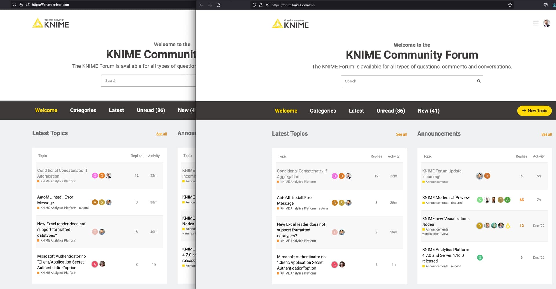
Inconsistent Header
Certain elements and section provide crucial orientation as they contain relative static elements like the logo, navigation, search etc… Therefore, if there is all of a sudden a change in design, it causes discomfort and the user must think if they are still at the right place (same website) or at least re-orientate in case they i.e. want to navigate back.

The header section completely changes when navigating into a post, causing this negative effect on the users orientation.

Sidebar Icon
To be honest, it’s the first time I noticed it as I thought, which kind of all learned from “mobile design” that the hamburger icon reveals the main navigation. Again, this makes me think “where is the main navigation”?

Furthermore, when outside of a post, the design doesn’t quite add up as the sidebar seems to take a higher place in the DOM hierarchy as the main navigation … which also wraps not quite nice.

Menu Ribbon
Why create a distinct page like categories which only contains a few elements? “Welcome” reminds me – no offense though – of the “good old days” when everyone greeted their visitors with a non-user, non-seo friendly welcome text. What I want to say is, it feels like a wasted opportunity.

Now it’s easy to complain so here is an idea. What users are (likely) most interested in is the content of the forum. Why not displaying the post with the most attention, the recent solutions, a hall of fame of forum editors choices or put Knime to it’s paces displaying a dashboard about the current state of the forum (sentiment, time to solution, time to resolution for bugs, announcements / updates resulting in peaks of interest by sparking new ideas)?

Adding to this, you have duplicated content … https://forum.knime.com/ vs. KNIME Community Forum
Both sites also have a unique canonical.

Search
The suggested Search Results are nice but only after the second return I pressed I am presented with the actual result page. There is no submit button and clicking on the magnifier icon does nothing.

On the result page it is not possible to refine my results i.e. by filtering for posts with with solutions. If I could make a recommendation here, FactFinder is a tremendously great tool. I still am in contact with these awesome guys and could connect you.

Visited Links
Gray color on gray background … difficult.

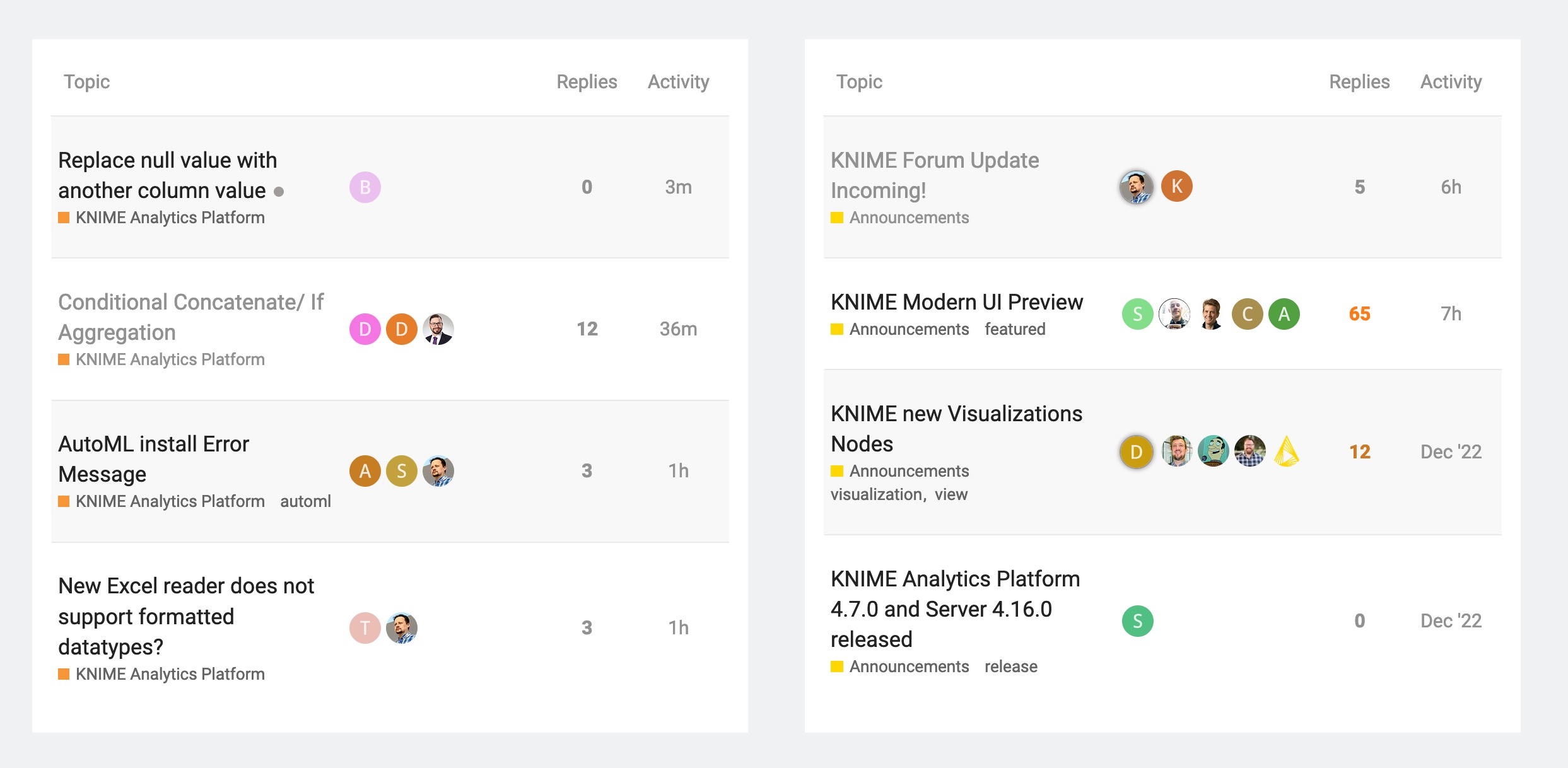
Spacing / White Space Distribution
Giving the text a bit more space by reducing the size of the icons column, reduces holes caused by word break and makes the table look more harmonic
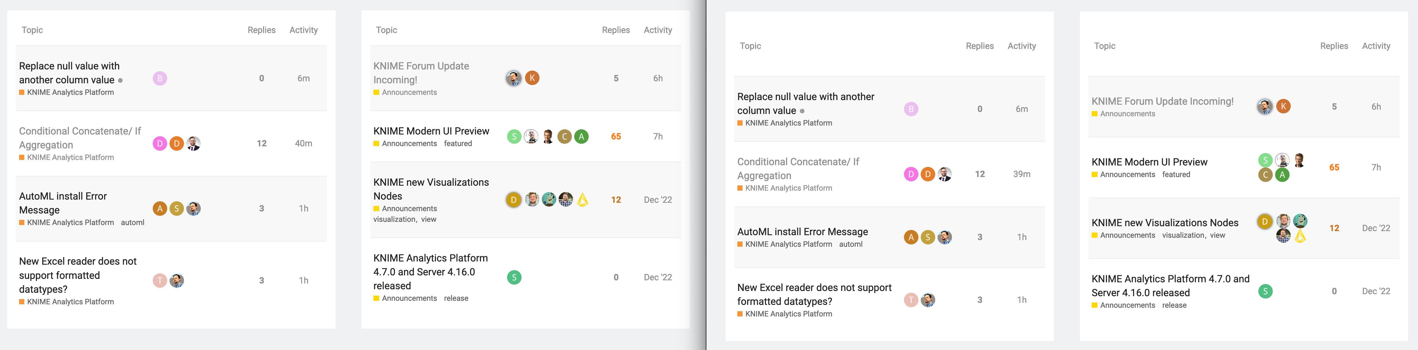
Sticky Table Head
When scrolling down it’s hard to remember which column was Replies, Views and Activity.

Sort Replies, Views etc. asc/desc
Sorting cannot be undone to revert to the original "newest post first! state. It is also not clear, as there is no icon indicating sort-ability, that the grey text offers any functionality. I once a while i.e. check for recent posts without a reply to try to help the helpless.

Mobile Responsiveness
I think we all agree tables are a nightmare. Here is a quick tip / example for responsive html tables I introduced when working as a Product Owner of a former employer managing a global Magento platform. Not mentioning that without intention … if you need a fresh pair of eyes, ping me.

Stopping here as I am carrying my little son while replying :wink: Don’t let my feedback discourage you. I am certain lots of work has been put into this and the mentioned aspects are only some little dents at worst. Keep going!

Cheers
Mike

5 Likes

A few more things about this sub-menu:

  1. Gray background color is not necessary
  2. Gray icons are barely recognizable and differentiable. Not to speak about the tiny positive (white) text. Contrast is key to readability :wink:
  3. It seems, or maybe I never read them, notifications form the very beginning are listed
  4. The most important notifications, the replies, are located as the second but not first menu item
  5. Again, replies from years ago appear like this
  6. The View all button animates to scroll to see more notifications as that’s what the bottom down icon indicates. There is enough space to write the text … like for dismiss.
  7. Dismiss and the check mark icons are contradictory to each other. “Read all” seems more logical for that icon.
  8. The gray #-Icon at the very top right, in a barely noticeable region (remember heat maps) would be better discernible if it had a red bg color (do not fall victim and use the Knime yellow inflationary)
  9. Stay consistent with your gray. The light gray used for other icons or text elements “rgb(209, 208, 208)” is too bright compared to the background gray of the sub.menu “rgb(227, 225, 224)”
  10. I dismissed the two categories replies and likes, yet many still appear under the primary all category.

Coming back to the display of the sidebar:

  1. The hamburger icon is located to the very right but the sidebar open on the left. This drastically increases eye travel / gaze path distance
  2. There is plenty of space to the right. The timeline feature is granted quite a lot of white space. Why not switch the timeline to the left and sidebar to the right. That would directly connect each post with the timeline function. Though, the reply date in the top right of each reply might be relocated as well like to the other icons in the bottom right?

This topic was automatically closed 90 days after the last reply. New replies are no longer allowed.