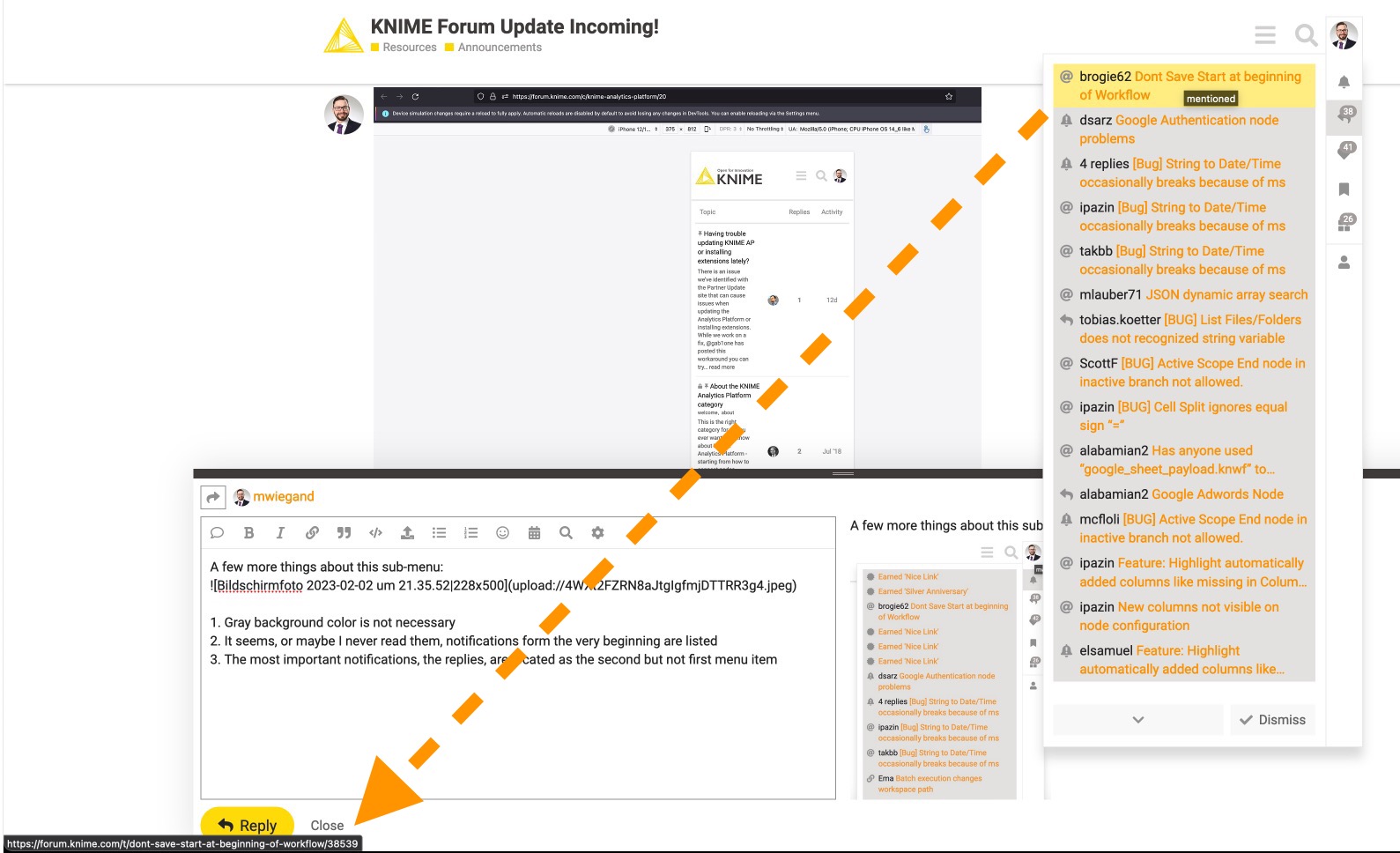
A few more things about this sub-menu:

- Gray background color is not necessary
- Gray icons are barely recognizable and differentiable. Not to speak about the tiny positive (white) text. Contrast is key to readability

- It seems, or maybe I never read them, notifications form the very beginning are listed
- The most important notifications, the replies, are located as the second but not first menu item
- Again, replies from years ago appear like this
- The View all button animates to scroll to see more notifications as that’s what the bottom down icon indicates. There is enough space to write the text … like for dismiss.
- Dismiss and the check mark icons are contradictory to each other. “Read all” seems more logical for that icon.
- The gray #-Icon at the very top right, in a barely noticeable region (remember heat maps) would be better discernible if it had a red bg color (do not fall victim and use the Knime yellow inflationary)
- Stay consistent with your gray. The light gray used for other icons or text elements “rgb(209, 208, 208)” is too bright compared to the background gray of the sub.menu “rgb(227, 225, 224)”
- I dismissed the two categories replies and likes, yet many still appear under the primary all category.

Coming back to the display of the sidebar:
- The hamburger icon is located to the very right but the sidebar open on the left. This drastically increases eye travel / gaze path distance
- There is plenty of space to the right. The timeline feature is granted quite a lot of white space. Why not switch the timeline to the left and sidebar to the right. That would directly connect each post with the timeline function. Though, the reply date in the top right of each reply might be relocated as well like to the other icons in the bottom right?