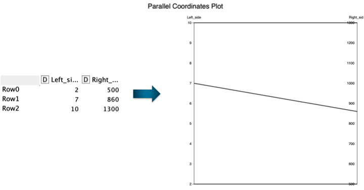
Followed-up with Natasja’s question, I have the same request of adding the feature of adjusting the left and right side axis to the same range. Here is an example.
I would like that the left axis and the right axis have the same range in the plot (e.g. 0-2000 for this example). So we can see the trend more clearly. In Python, it is possible to adjust the axis ranges (Parallel coordinates plot in Python). It would be great if we could do the same with KNIME.
Please take a look at the following example workflow.
It should show you a workaround that works for you for the parallel coordinates plot and other views.
Please be aware this issue should hopefully be fixed when this new view nodes get out of labs!
Yes, for the new views you can see this already working for the scatter plot. As soon as we tackle the parallel coordinates plot with the rewrite, this will probably also be possible for that new node.