Hi,
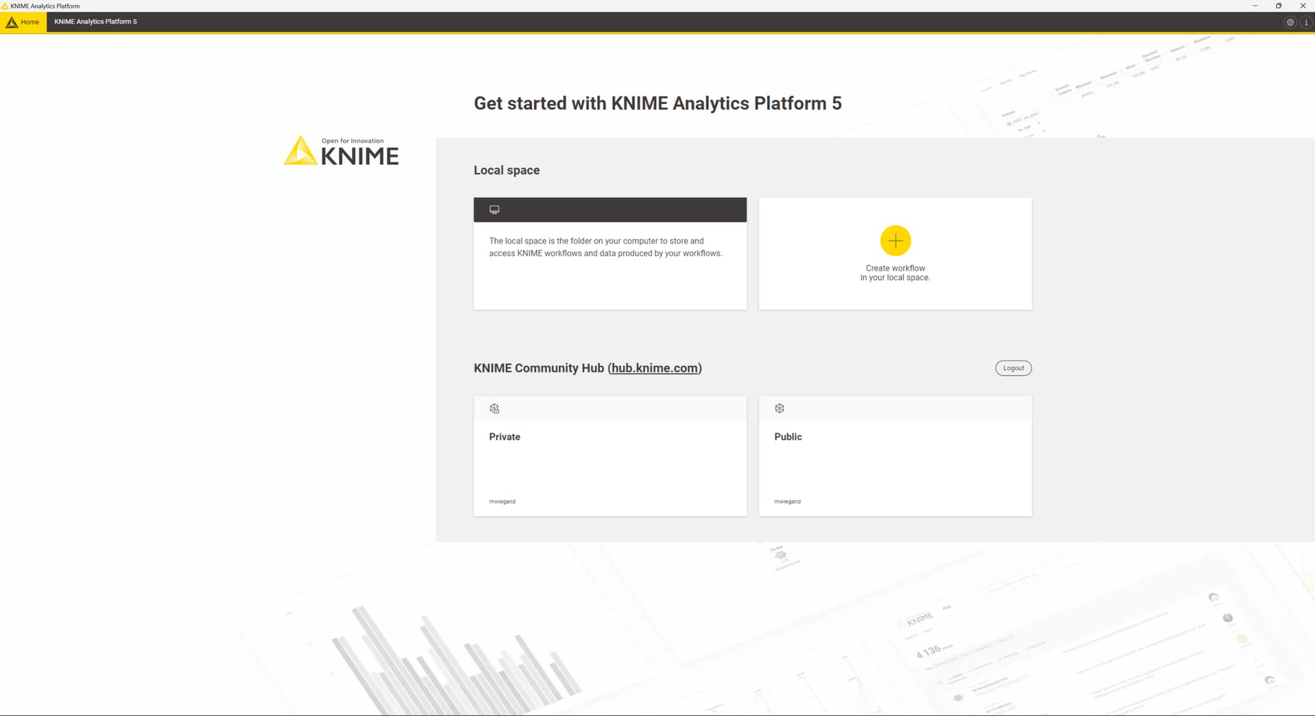
upon starting Knime with the new UI I find, in particular on large screens such as a 27 inch 4k, the home screen lacking information / wasting a lot of display real estate.
I’d like to suggest, since you seem to switch to a web based interface, to better utilize responsive design or allow adding respectively adjusting custom tiles such as:
- Display the local space directly w/o the need to first clock on the tile including the button ribbon atop
- Reduce the size of “Create workflow” to a button and move it into the button ribbon
- Add tiles i.e. like recent workflows, necessary plugin updates (not just the update button so you can skip scanning and just update), the most recent / trending forum posts, replies to someones started or commented posts
- Allow to quick reply (Dump question, do consider to tighten the integration between Knime and the forum for better interactivity?)
- What is the purpose of the “Add files” button in the ribbon atop the “Your local space”
- Allow to expand or collapse a workflow folder in the good old fashioned tree few
- Add the option to display columns such as Create Date, Change Date, Size
- Allow to display the workflow description and rendered image of the workflow once selected.
- Allow to browse the workflow data directory and manually upload files (maybe drag & drop too?)
- What is the purpose of the “Home” button in the top left. It has a pointer but no action it seems. It’s only nav-purpose seems to be when i.e. the info icon was clicked
How it looks for me right now:
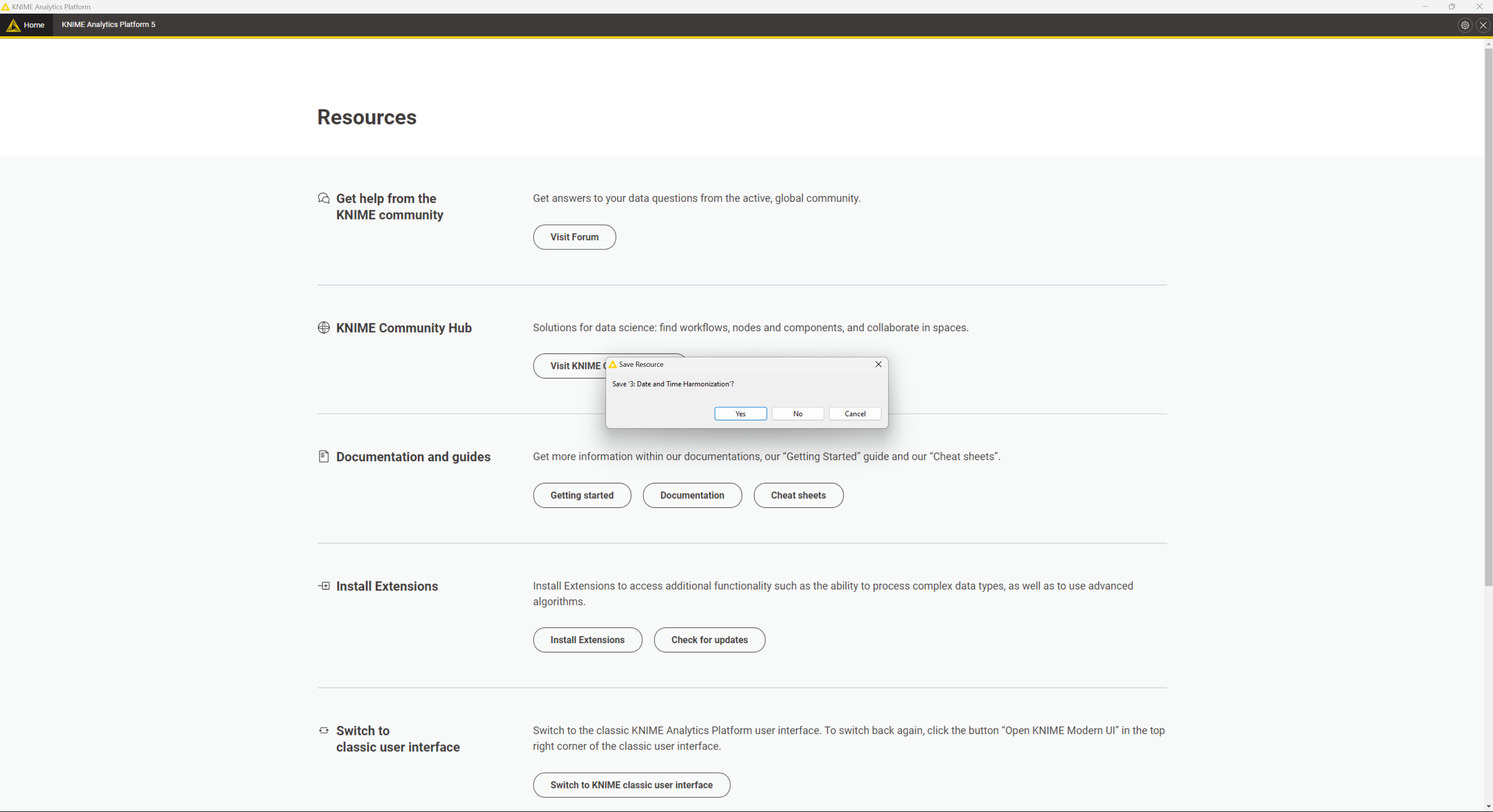
There also seems to be a bug as upon navigating into the local space and browsing back, the Knime community hub section went missing:

One last thing. When opening the settings the title ribbon stated “filtered”. But no filter was applied nor can anything get reset. The placeholder text I’d recommend to remove entirely as it actually seems like valid text. Usually, placeholder text should only be used on complex forms requiring explanation. That field however is self explanatory. The text is also not gray implying it is real text, which it isn’t.

PS: The info screen can also be made two or even three columns condensing the information substantially. Moving each sections headline right atop the text spares the unnecessary hole beneath it. Adding the sections which link the FAQ or even providing an option to search i.e. for a problem or topics like “performance optimization” might be quite nice as well.

PPS: I presumably had no workflow open. Even Knime was downloaded fresh. After installation finished however, I got e notice to save workflows whereas, as seen in above screenshots, none was opened. This further underpins the necessity to better visualize the workflows on the start / home screens.
Best
Mike