Hi,
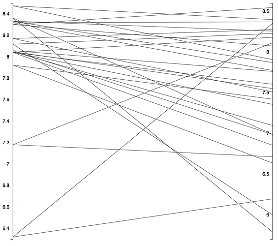
We recently started using the Parallel Coordinates Plots for matched pair analysis. We’re actually using the KNIME server to distribute multiple plots for each transformation at the same time, and this plot is at the core of the workflow, so many thanks for including these. However, you can’t control the axis ranges, which makes it difficult/impossible to assess whether the changes is really up/down or the same (see attached screenshot for a PKI plot). We’ve worked around it by included 2 fake matched pairs, one to set the bottom, another to set the top (see screenshot with colors).
It would be great if there could be an automatic check box to say “identical axis ranges” or something along those lines.
Thanks,
Natasja

