I have been learning to use matplotlib in Python for visualisation. There are a few examples already on the hub but from some time ago and therefore using legacy Python nodes. So, I’m just sharing an updated version using the latest Python Scripting nodes, in case they are useful for anyone
Here is the original matplotlib example, that creates a plot with 2 different y-axes, for example:
Thank you for the initiative to provide additional solutions @HeatherPikairos . I’m sure someone will find it useful.
I was the one asking on the other thread mentioned above regarding the dual axes chart. Been a long way since then - lots of adjustments were made from one version to another.
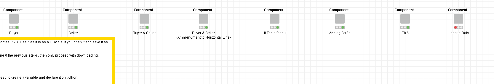
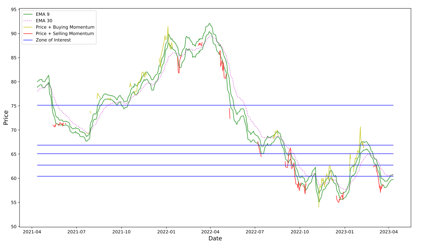
I started with the dual axes but ended up developing a single axis chart, although I must say it would be nice if I can create a histogram on top of this chart, to replace/be an alternative to the current ‘zones of interest’ lines. That’s something I might look into, and this is just a sharing from what I’m doing (not a request). Glad to know someone else is looking into dual axes graphs on Knime.
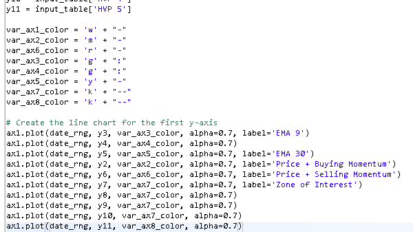
I haven’t had the chance to work on tidying up my scripts yet, because I’m currently preoccupied with the interpretation part of my project. There are some redundancies in this script. I’m sure you can spot them & do it better
As complementary information, I’m sharing the Python code, so people searching for this type of solution on Google can find it more easily:
import knime.scripting.io as knio

from io import BytesIO
import matplotlib.pyplot as plt
import numpy as np
import pandas as pd

#Plot creation
fig, ax1 = plt.subplots()

#Input data

data = knio.input_tables[0].to_pandas()

abs = data[knio.flow_variables['abscissa']]
data1 = data[knio.flow_variables['ordinate_1']]
data2 = data[knio.flow_variables['ordinate_2']]

#Vertical label
ax1.set_xlabel(knio.flow_variables['abscissa'])

#First plot color choice
color = knio.flow_variables['First_plot_color']
#Horizontal label
ax1.set_ylabel(knio.flow_variables['ordinate_1'], color=color)
#Creation first plot
ax1.plot(abs, data1, color=color)
#Parameters for first plot
ax1.tick_params(axis='y', labelcolor=color)

# instantiate a second axes that shares the same x-axis
ax2 = ax1.twinx()

#Second plot color choice
color = knio.flow_variables['Second_plot_color']
#Horizontal label
ax2.set_ylabel(knio.flow_variables['ordinate_2'], color=color)
#Creation second plot
ax2.plot(abs, data2, color=color)
#Parameters for second plot
ax2.tick_params(axis='y', labelcolor=color)

#Plot resizing
fig.tight_layout()  # otherwise the right y-label is slightly clipped

# Create buffer to write into
buffer = BytesIO()

# write the plot into the buffer
ax2.figure.savefig(buffer, format='svg')

# The output is the content of the buffer
output_image = buffer.getvalue()

# Assign the figure to the output_view variable
knio.output_view = knio.view(fig)  # alternative: knio.view_matplotlib()