I’ve generally held back on going down the rabbit hole of comparing Modern UI with Classic, but I would be interested to know what the future direction of the Data Table presentation is. I made reference to a number of shortcomings of Modern UI’s data table presentation back in September last year, so apologies that I am repeating here some of what I said then, but I feel it is important.
With the various improvements that have been made to Modern UI, I enjoy using it, and mostly will do so in preference to Classic UI (although I do still switch between both).
I know there have been a number of discussions concerning the Modern UI Table views here on the forum, and as I have mentioned elsewhere, I am excited about the upcoming 5.3 release, but as yet I have not seen much mention of major changes to the data tables views.
I don’t want to jump the gun and from looking at the nightly build, I do know that 5.3 is likely to bring with it the introduction of shortcut keys for opening the various data ports both in the lower data panel (Shift+0 = Flow Variables, Shift+1=First data port, Shift+2=Second data port, and also as popup windows (Alt+Shift+0, Alt+Shift+1… etc). I’m not necessarily wild on the choice of key assignments - and would prefer to be able to define my own - ![]() , but it’s an improvement on having no keyboard shortcuts.
, but it’s an improvement on having no keyboard shortcuts.
Besides the shortcut keys though, I’ve not spotted much else new with the table outputs themselves, and this is a key area that I’d like to see improved, as for me it is one area where I still find I’m working much less efficiently in Modern UI vs Classic UI.
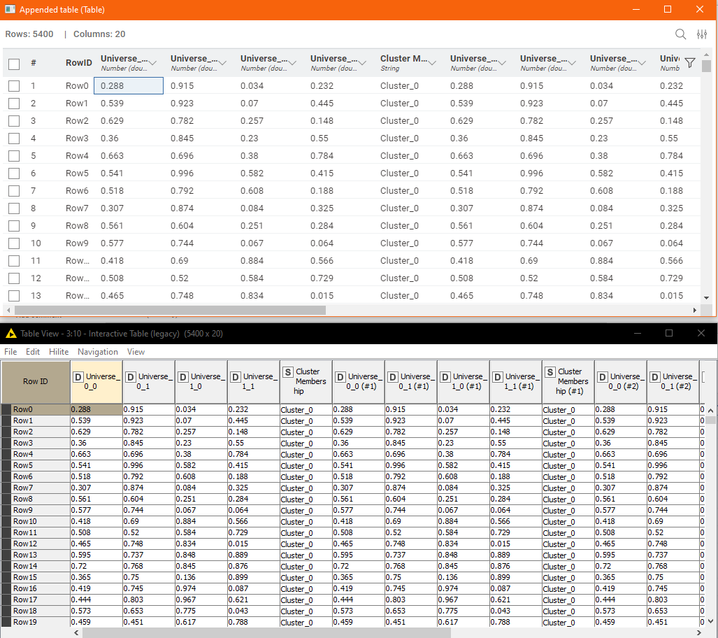
Take a look at the following two windows. They both take up exactly the same amount of screen real estate, and are both presenting data from the same table.
The top one looks more modern, for sure, and yes it does have a search field, but the lower one remains to me so much more efficient in actual use.
Key features:
- I can read the Row ID beyond Row9, without any effort
- I can view more rows at a time (less wasted space)
- I can view more columns at a time (less wasted space)
- I can wrap the column names (as shown) so I can read the entire column name for all columns with a single operation (and still see more rows and columns!)
- I can page up/down using key presses
- I can navigate between cells using key presses (Cursor Keys, Home, End, pgUp, pgDown etc)
- I can select multiple non-contiguous columns or rows, using the Ctrl key for copy/paste e.g. to Excel (yes it’s a thing
 )
)
I use (almost) all of the above features pretty much all the time when using the classic UI or the “Interactive Table (legacy)” node, and I really notice the inefficiency of the Modern UI table, as soon as there are lots of columns, with no simple way of displaying (wrapping) “whole column names”, and no way to view entire column names without manually widening every individual column.
Don’t get me wrong, the Modern UI data table is slowly improving. The whole Modern UI is getting better. The ability to detach a table is an improvement from where we were with 5.0, but, I see the continued inefficiencies in the table view as likely to be the biggest blocker (notwithstanding Console Log) to adoption of the new UI by many of the stalwarts of Classic, so I’d be interested to know what (if any) is the road map for the above list of features.
To me, they aren’t just “nice-to-haves” but are essential to the ongoing success and adoption of KNIME and the Modern UI. I hope that efficiency and usability improvements to the Table Views are seen as a priority. If they aren’t…well… I think they really should be. Thanks. ![]()
