Hi @DanielBog , I have been trying to work more with Modern UI, but I have realised that the ability to view the data efficiently is probably the single biggest factor preventing me using Modern UI in the day job.
Aside from the additional functionality issues that @iCFO mentions and uses, purely in terms of visual efficiency, I thought I should highlight what it is about the classic data viewers that make them much more efficient for me. I’d really like to be able to move to modern UI day to day, so I hope this feedback will be of use.
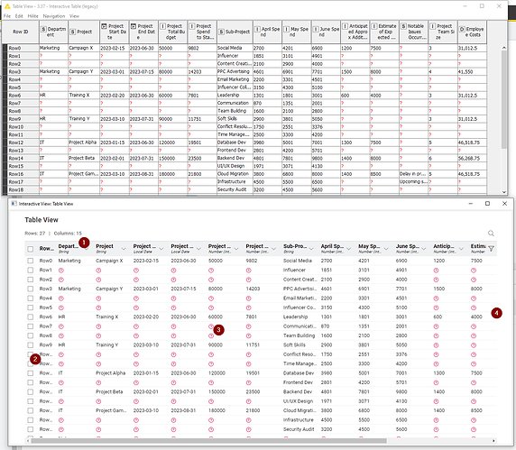
Here is the same data being shown from the same workflow in AP 5.1 The top is the Interactive Table (legacy) node, and the bottom is the Table View node (in “Compact” format):
The numbers relate to the following notes:
(1) The heading ideally needs to be the same size font as the data. I see no reason why it needs to be made larger. It is clearly the top row and it can be differentiated by colour if need be, rather than by size. Making it larger simply reduces the ability to read it without widening the columns. Unlike the legacy node, there is no ability to wrap the headings, so to read all the columns in the Table View above, I would have to manually widen every column.
(2) The RowId column as standard is not wide enough to tell me any row number above Row9. I have to widen it every time I want to view it.
(3) I find the red circled (?) much “louder” than the classic counterparts. In classic, my eyes are drawn to the data. In modern, my eyes are drawn to the “missing values”. This is possibly just a personal thing, but I’d welcome the ability to change the style of the marker
(4) Modern UI does not display as many columns in the same screen width. In the above comparison Classic has three more columns displayed than Modern, without using any more desktop area.
I can see that Modern viewer may have the ability to provide some greater functionality in future, but it needs to not lose the visual efficiency of its classic counterpart in the process. The Interactive Table (legacy) node is the only way I can currently work with data output within a similar efficiency that I get in classic, but having to drop them on the workflow significantly negates that efficiency.
I am grateful for the amazing work the KNIME team are doing with taking the platform forward, so I look forward to the re-inclusion of being able to view output ports directly on the workflow in a more visually-efficient format.
