Of course.
So, basically I am trying to show flow of the basketball to map assists. So basically, every basket is associated with a player who shot the ball, and sometimes, a player who assisted the ball to the shooting player.
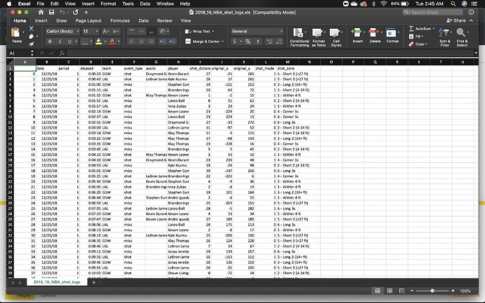
The data file, it too big to upload so here is a screenshot.
So if you look at the data set, you can see the team, the player who shot the ball, the shot_zone, if the shot was made, and if the shot was assisted by a player.
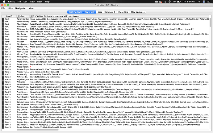
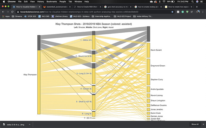
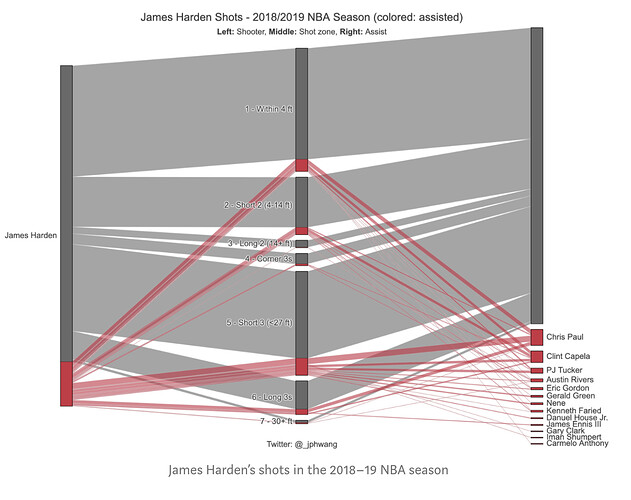
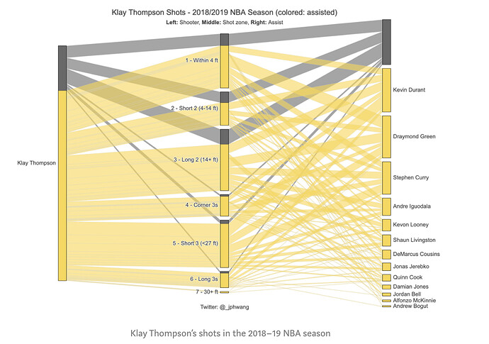
First, I want to organize by data so each player has a count of the total shots, they made, and of those shots, a count of the assist and by which specific player. So that I can create the following for individual players.
So on the right, you can first see the individual player name, in the middle the shot zone for the shots they actually made, and on the right, if the shots were assisted by a player then the player name and the color is yellow if the shots were assisted.
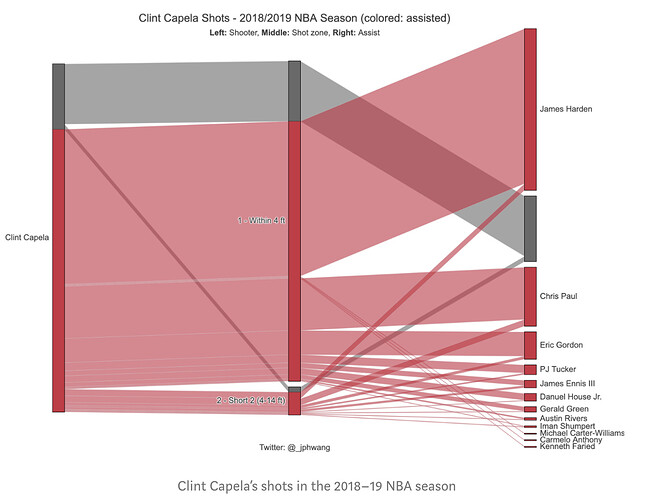
For example, Clint Capela, the big red stripe at the top connected to James Harden shows he made a bunch of shots from assists from Harden, while the dark grey connected to a strip with no names shows shots he took on his own.
So I need help structuring by data and how I can create the graph. For previous data, someone did suggest the String Manipulation node with the regex replace option but I don’t know how to create a string to manipulate the data like that.
Does that make more sense?
