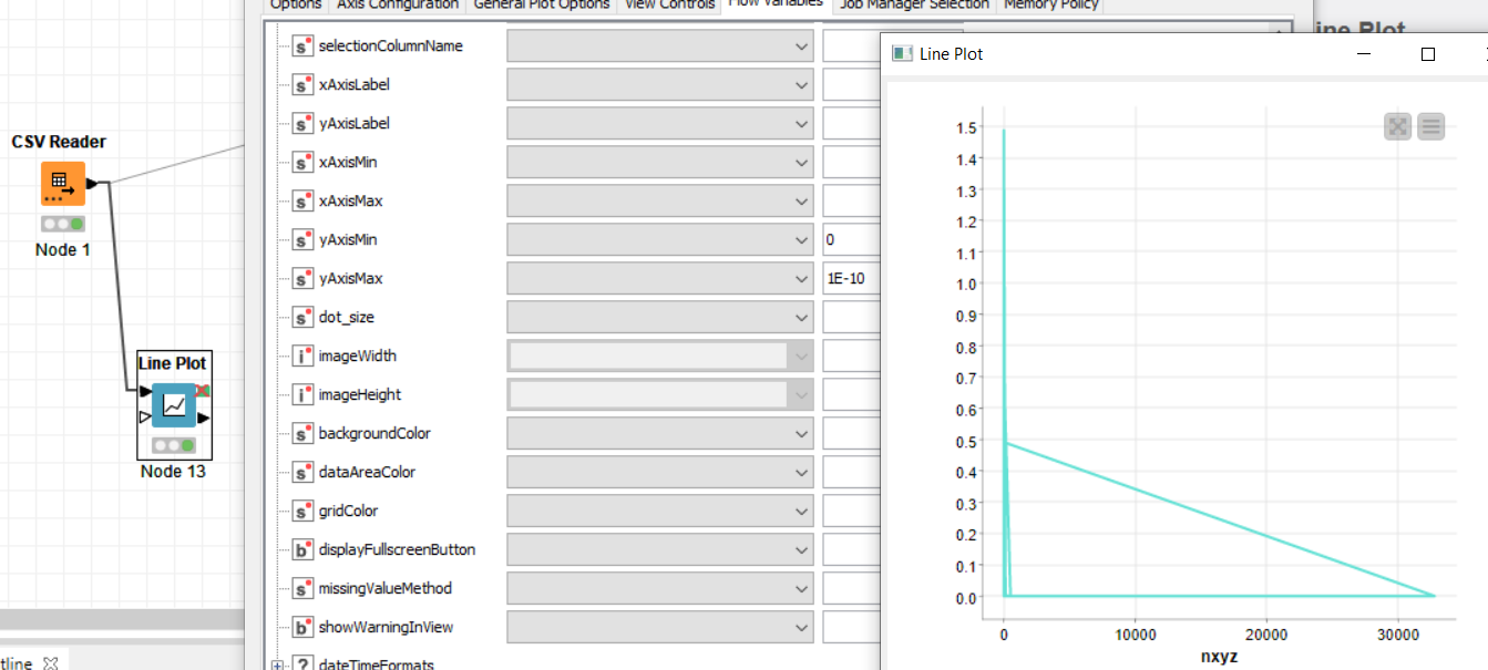
In the workflow below, I have set y-axis limits to [0,1E-10], but does not seem to be honored in the plot.
Am I missing something?
In the workflow below, I have set y-axis limits to [0,1E-10], but does not seem to be honored in the plot.
Am I missing something?
Hi @tims
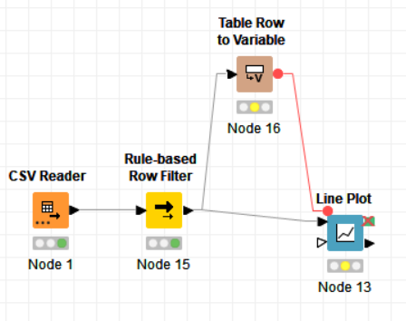
Those fields that you are using in your picture are to define flow variables for output, they are not for input. To set the axis limits, define a couple of flow variables that contain the desired axis limits and choose them from the pull-down menus on the left. You can do this with a Table Creator followed by a Table Row to Variable node. This will give you a red flow variable connector that you can drag to the upper left edge of the Line Plot node. I had a related problem once, see this suggestion by @HansS for the solution.
It is a pity that there is no way to enter values in this window directly.
Best
Aswin
Thank you @Aswin
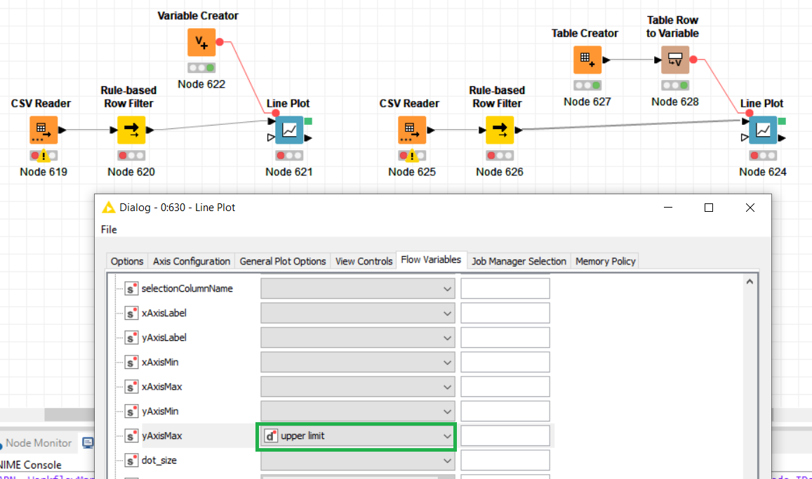
It is still not clear to me what goes into “Table Row to Variable” configuration and where the axis limits are set.
To create a static Flow Variable you can either direclty use a Variable Creator, or a Table Creator with a chained Table Row to Variable node.
Here’s where you can con control nodes with Flow Variables:
There is more than one way to do it, but if you follow @HansS ’s example, you enter the axis limits in separate columns in a Table Creator node. These are then converted to flow variables using a Table Row to Variable node. Then you can use the flow variables to set the axis limits in the same window as in your original post (in the pull down menus).
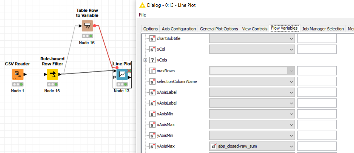
this is still confusing to me.
Using table to row, I set the Double field to 1E-5 and chose one of the column names.
In Line Plot flow variables, I chose the above defined variable for yAxisMax
y-axis range hasn’t nudged a bit
What am I missing?
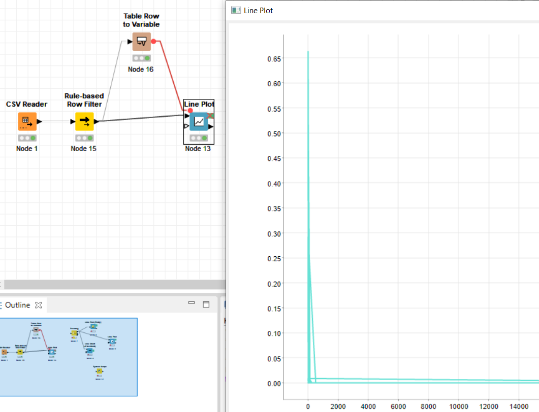
I was able to reproduce that behaviour, it seems both the upper and the lower axis limit need to be defined for it to work.
Setting both limits helped.
How can I see y-axis labels in scientific notation and log scale.
I couldn’t find any setttings for axis transformation or axis formatting, but I’m not familiar with the JavaScript visualisation nodes.
You might want to have a look into Rs library ggplot2 if you frequently hit the limit of what KNIME base nodes can do. It allows to make nice and detailed plots, but the learning curve is also kinda steep.
This topic was automatically closed 7 days after the last reply. New replies are no longer allowed.