This week, our challenge explores the EuroVision competition using network mining techniques . Give it some thought!
Here is the challenge. Let’s use this thread to post our solutions to it, which should be uploaded to your public KNIME Hub spaces with tag JKISeason2-8 .
Need help with tags? To add tag JKISeason2-8 to your workflow, go to the description panel on the right in KNIME Analytics Platform, click the pencil to edit it, and you will see the option for adding tags right there. Let us know if you have any problems!
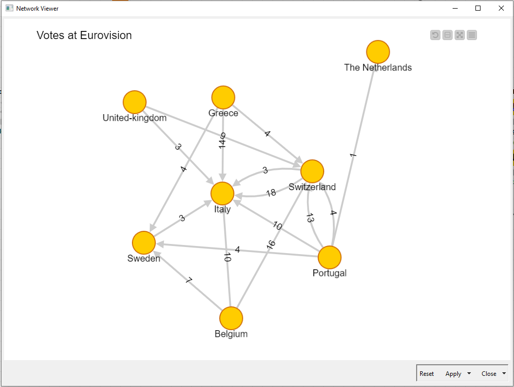
Hi!..I think this is my worst Workflow i did till now…but it should guarantee what requested…
Anyway…next days i’ll try to improve it in order to get a better visualization.
Hello everyone. Here is my solution, where I also decided to go a bit beyond the basic requirements of the assignment and created a pipeline to insert the data into Neo4j — a native graph database.
This approach is useful from multiple perspectives:
the data is already represented in the graph
you can visualize it pretty much the same way as the assignment asks for
it possible to use graph data science algorithms
it helps to easily answer such important question as who liked both Portugal and Estonia the most in 2018.
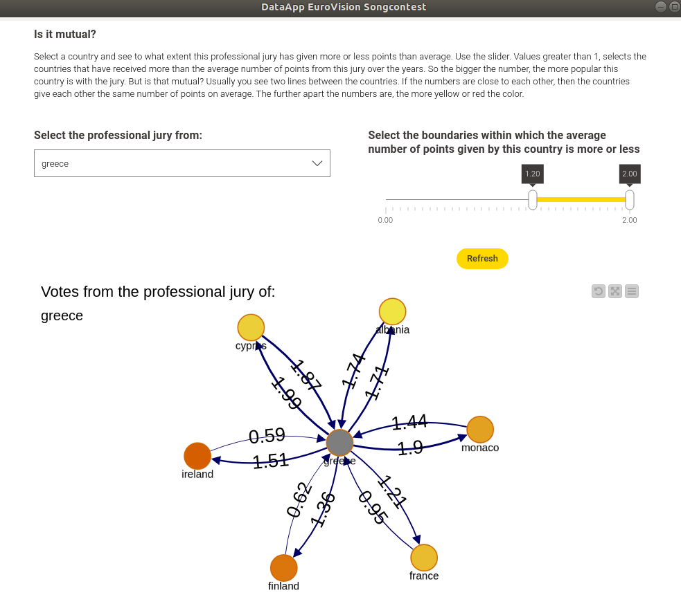
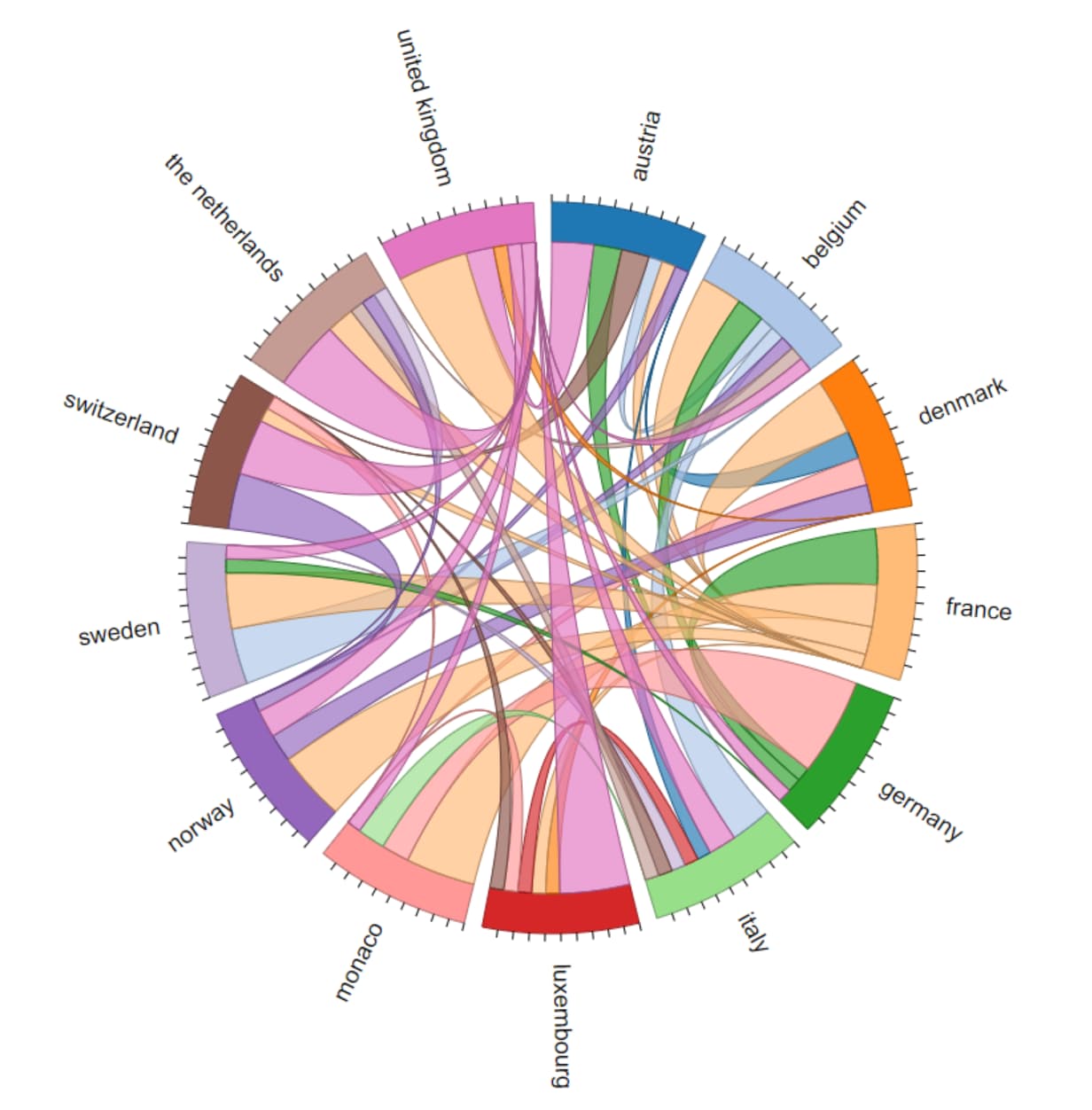
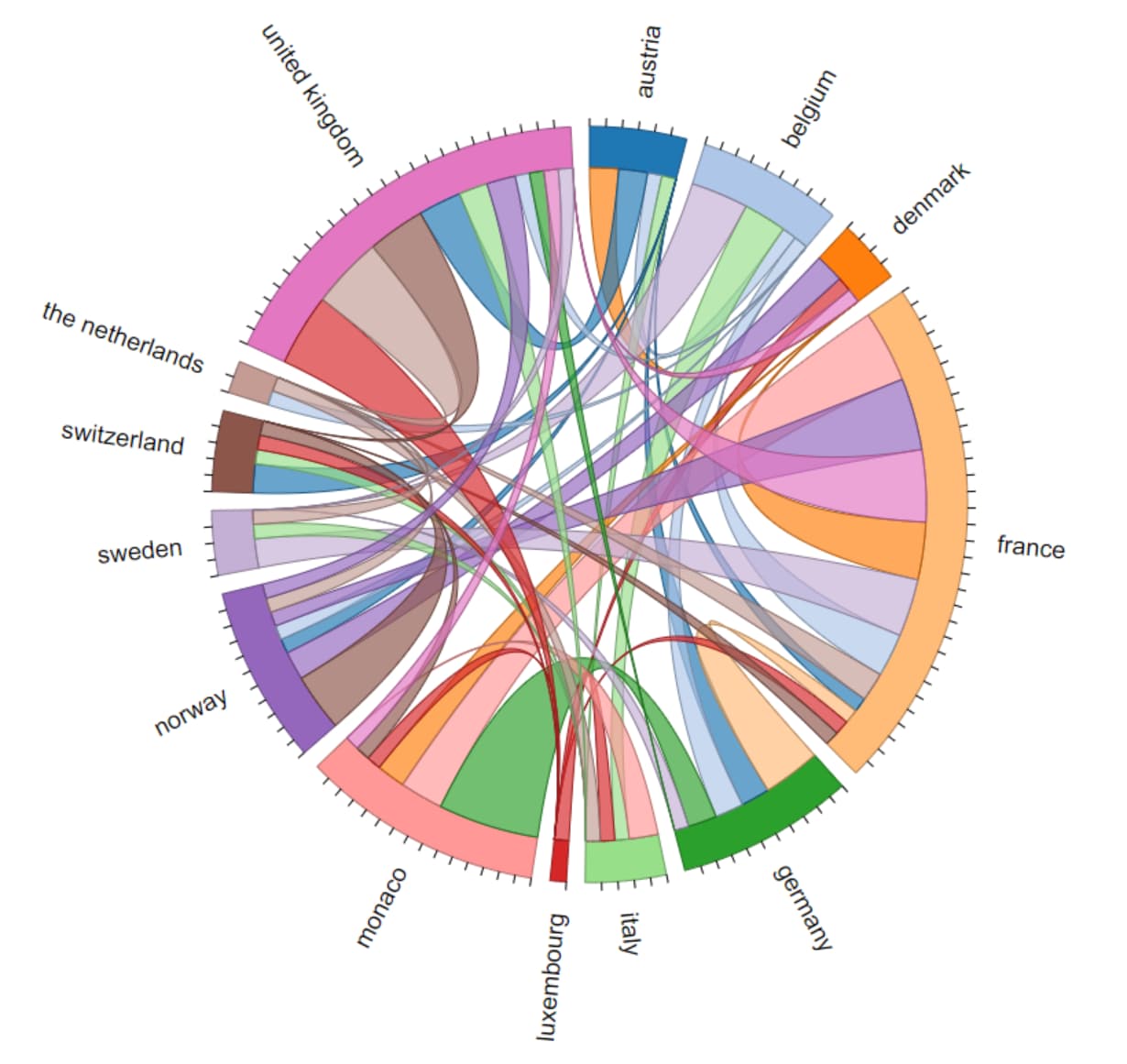
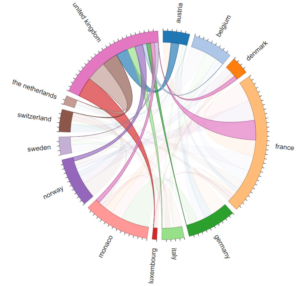
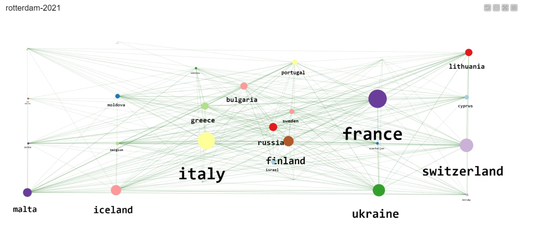
The Chord Diagram is a really useful way to create a network that shows the relationship between pairs of countries and their voting choices. You can hover over one particular country on the Chord Diagram to more easily see the network for that country:
After learning how to create a movie in the last challenge, I have decided to use the same set of nodes to create movies of the evolving points distribution over the years.
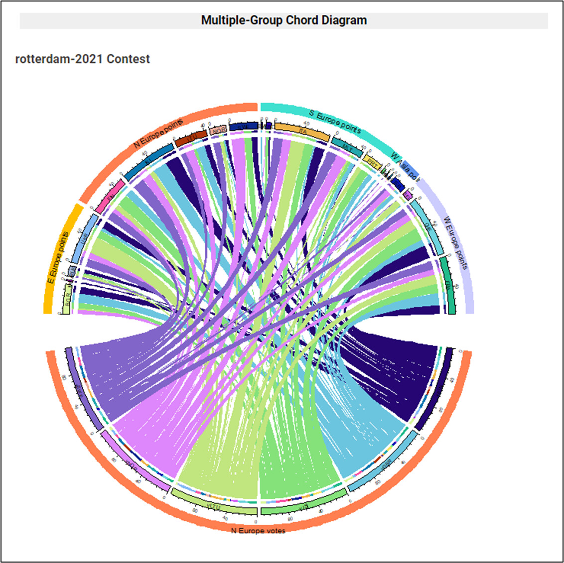
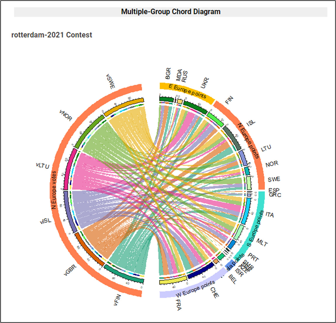
I was already working on my take with ‘Multiple-Group Chord Diagram’ ; when @HeatherPikairos ’ solution just popped up in challenge’s topic. Just congrats for the great work and very clean Java charts.
For this approach I am also using a Chord Diagram, but maybe more focused on analysis. I’ve had to code it in R, as my Java skills just trend to 1E-2 . R ‘circlize’ package has a lot of fun as colours in chart are random.
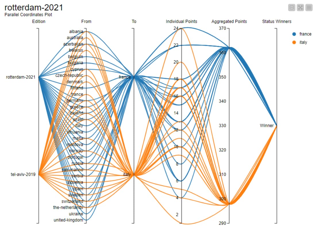
My Take on the challenge 8 on network … Network diagram is effective on direction but parallal coordinate plot is more insightful… wish we have a sankey node too… or PCP can be exdended to sankey.
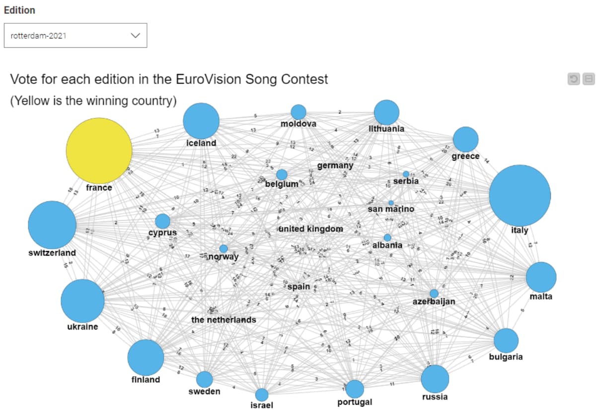
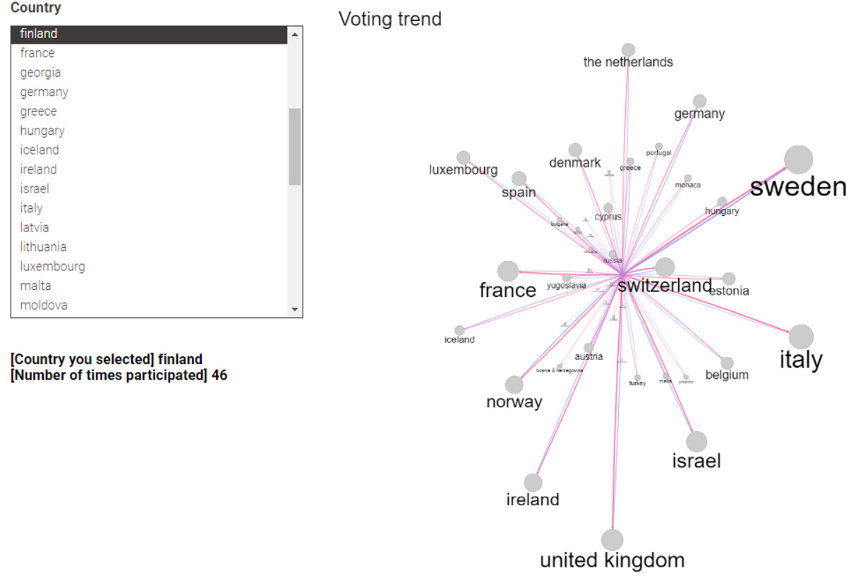
I guess total points since the first year would give kind of voting trends by country.
Node size means sum of points given by a country you selected, line width, sum of points of “From” or “To”. Blue and red lines mean “From” and “To” respectively.
Thanks.
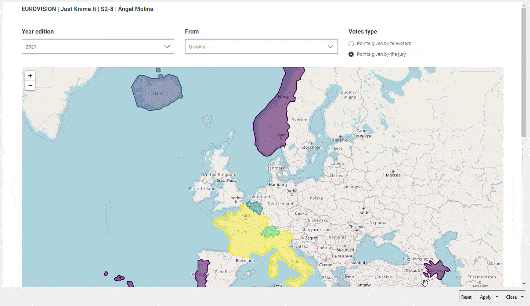
Hi KNIMErs
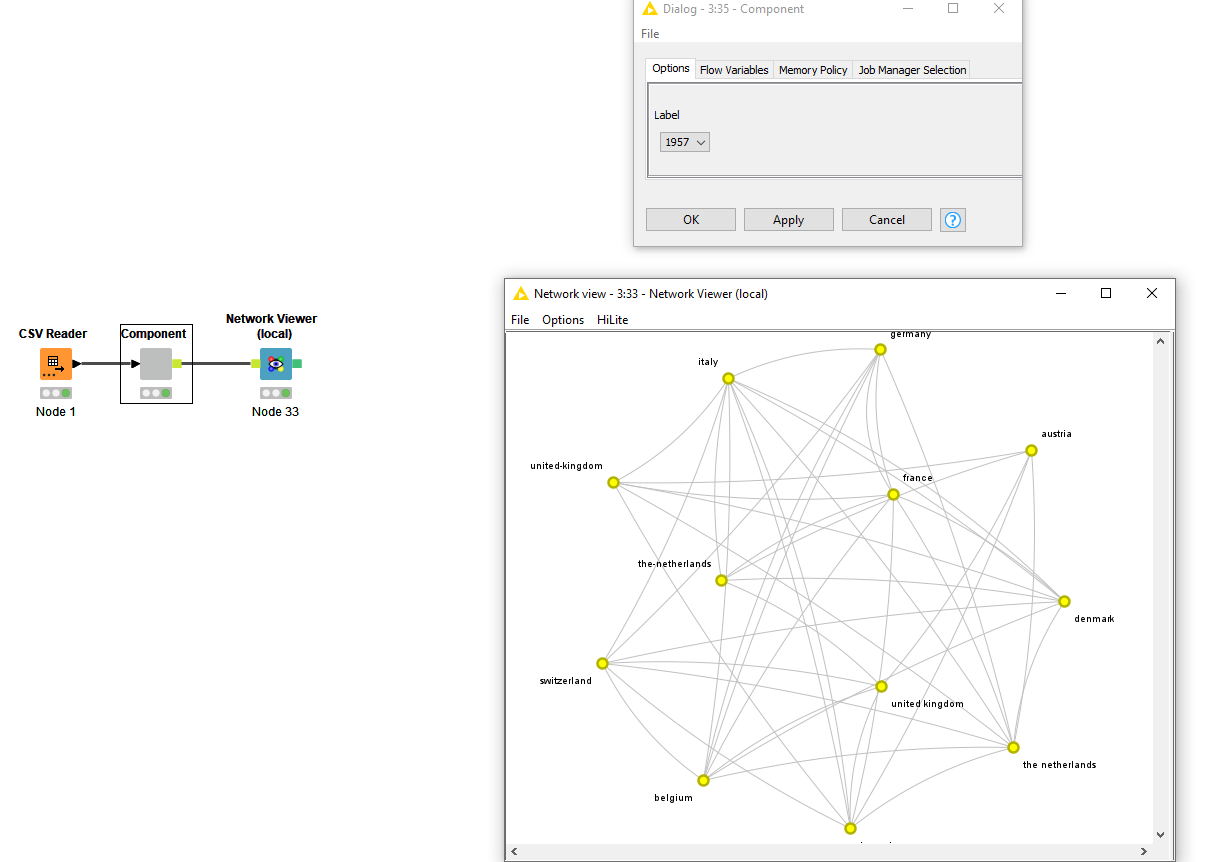
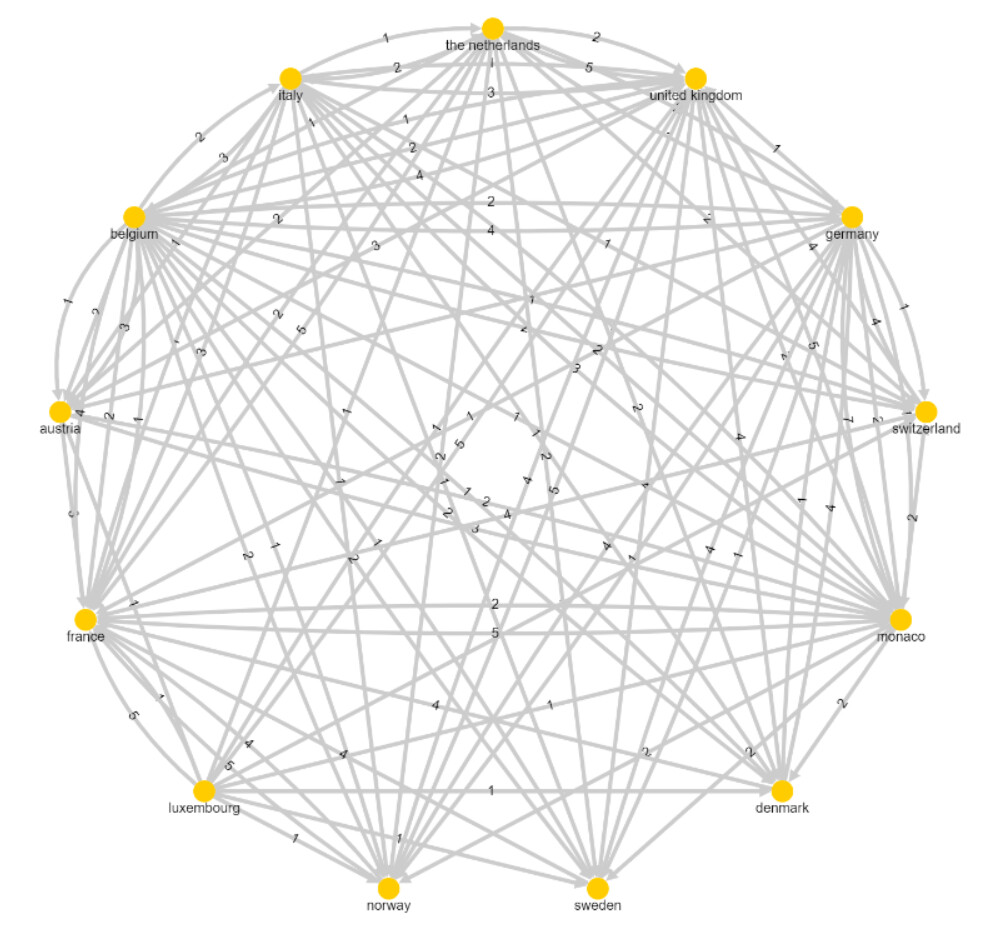
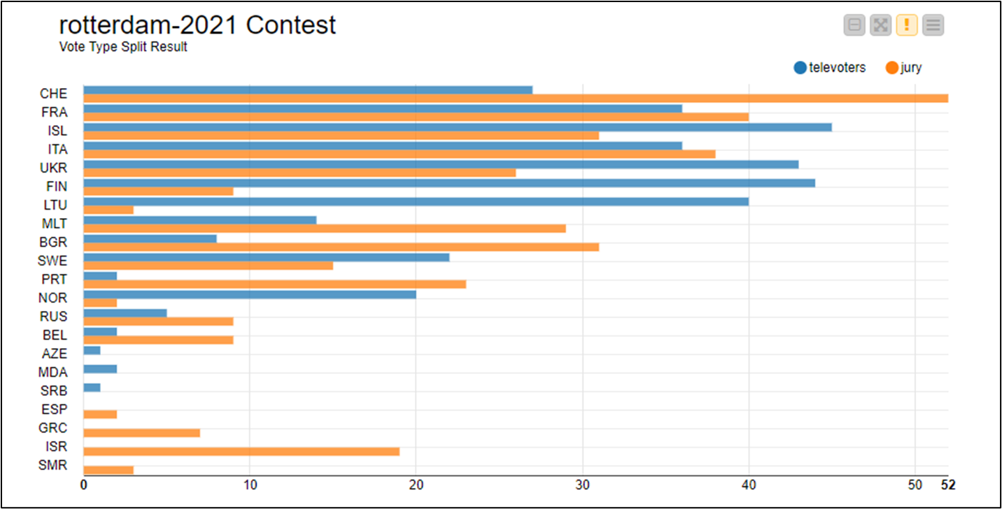
Some debugging in podium chart and an added Sunburst has happened since my lastest post. The reason I am not working with Network Mining nodes is because I already experimented with them in JKI S1 CH35 (LinkedIn Network Graph), and I like to experiment with visualizations that I hadn’t used before.
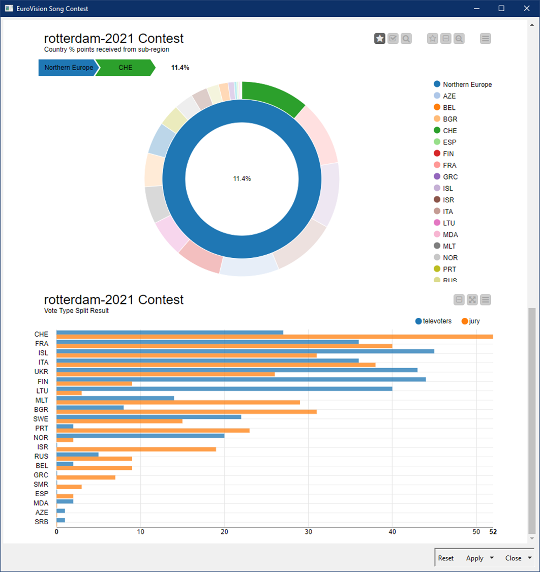
This is a capture for the same dashboard query configuration as it looks like now:
Did you notice there were invited countries from overseas in previous editions?
I am now updating the chart dictionaries to sectorize those sub-regions.
Disfruto más que un en un charco He querido implementar para seguir aprendiendo del los nodos geoespaciales, los cuales, me parecen una autentica bestialidad. Igual en esta ocasión no era su mejor utilidad, pero aún así lo he disfrutado y sobre todo, he aprendido el potencial que tiene
Hello KNIMERS
Tonight I’ve been working on the latest upgrade for the challenge workflow, just before submission deadline. I want to keep you updated on relevant changes in the code.
R Multiple Group Chord Diagram:
Inner ISO_ocuntry labels have been moved to an external radial position, for a cleaner reading and bar size correlation.
Diagram has been rotated 90 degrees (votes on the left hand side position, points to the right)
Introduce chart color control based on RColorBrewer library palette.
A network view (Network Mining nodes based) has been added to the dashboard, aiming to fully accomplish with challenge description request.