Solutions to "Just KNIME It!" Challenge 17

This thread is for posting solutions to “Just KNIME It!” Challenge 17. Feel free to link your solution from KNIME Hub as well!

Here is the challenge of the week: Just KNIME It! | KNIME

Have an idea for a challenge? We’d love to hear it! :heart_eyes: Please write it here .

And remember: the more you participate, the more participation badges you may end up getting. Fancy, huh? :wink: Just remember to correctly mark your solution in the Hub with tag justknimeit-17. :grin:

Hello KNIMErs,
Here is my solution for Challenge 17

2 Likes

Hello everyone,

here is my solution:

Have a nice evening,
RB

2 Likes

Hi

Here’s my solution.
I’ve used a few more nodes than needed to make it easier to follow the flow

image

cheers!

2 Likes

My solution

2 Likes

Hi everyone,
Here is my solution.
No CSV reader (just for testing purposes)
I calculate yearly average values and overall variance for drastic changes.
I did not use loops but intended to do so.
Should have use Table Manipulator :slightly_frowning_face:

2 Likes

Hi all,

here is my solution and some pictures of the results:

and some pictures of the results:
2)
Bildschirmfoto von 2022-05-21 22-12-54

Bildschirmfoto von 2022-05-21 22-13-10

Best regards
Andrew

3 Likes

This challenge brings special points and a degree of complexity to the requirements.

The following is my interpretation and implementation of the challenge.

The Data for each point are:

  1. Read direct from the URI
    image

  2. The top 3 regions with drastically changes
    image

  3. Find the state (regardless of region) with the lowest prices for homes on average currently.
    image

  4. The bankruptcy of Lehman Brothers


3 Likes

My Take on Challenge 17 -Housing market madness

2 Likes

Here’s my solution. I used the three highest relative price changes from 2000-2021. The results are somewhat counterintuitive. I added San Fransisco for comparison to a high absolute change. The workflow is in a Dropbox link.

2 Likes

:boom: As always on Tuesdays, here’s our solution to last week’s #justknimeit challenge! :boom:

We used components to facilitate the creation of interactive views and to encapsulate solutions to different questions.

See you tomorrow for a new challenge!

4 Likes

Here’s my solution.
Q2:
From the statistics, we see that San Jose, CA, San Francisco, CA, and Summit Park, UT have the biggest standard deviation by year:

Q3:
Lowest prices for homes on average currently: WV (West Virginia)

Q4:

1 Like

Hello guys !
A little late to the game but I didn’t want to miss this opportunity on data visualizations !
Here goes my submission for the challenge. It was nice to see different approaches and results.

2 Likes

Hello KNIMErs,

Here is my solution to #justknimeit-17 :

KNIME Hub > gonhaddock > Spaces > Just_KNIME_It > Just KNIME It _ Challenge 017

Despite I’m trying to catch up with the challenges, once again enjoyed the take on it.

Aiming to simplify the analytical approach, I just filtered the dataset for the closing year prices (this is filtering by including only December months); some more work could be done to reduce the gaps…
Afterwards to normalize observations avoiding pricing bias, I computed the yearly variation (from previous year) in percentage.

Q2.- The initial Max. variations gave me a bored answer with similar behavior of three California Regions. Then I confronted the Max. variation champion from the different States, displaying some more flavour for the different State ways.


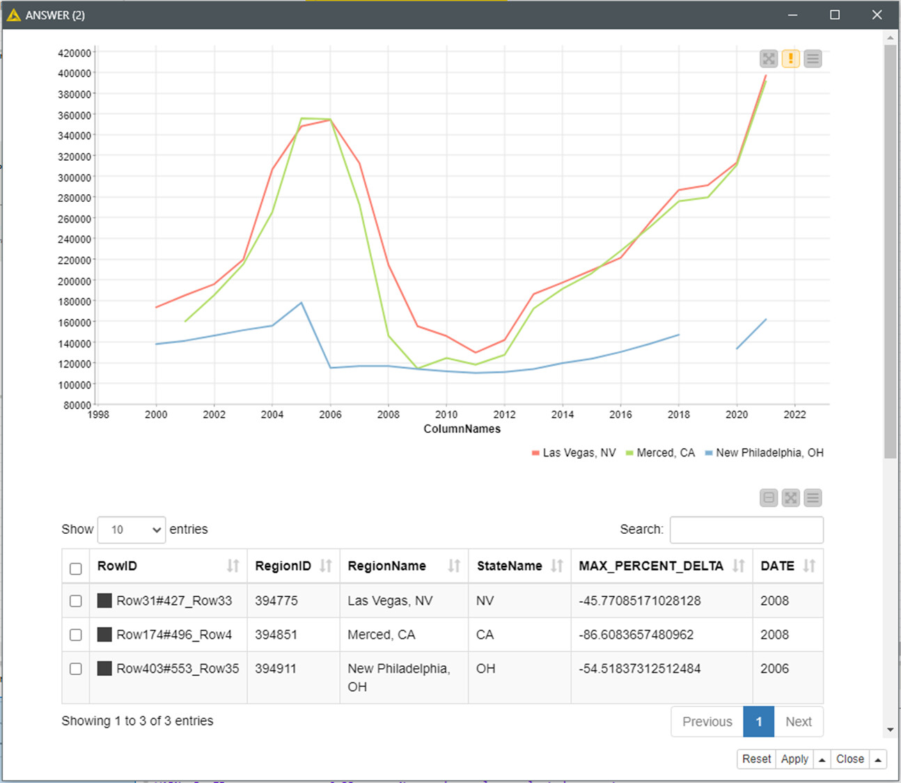
New Philadelphia OH (in blue) was strongly affected by the the 2003–2006 house price boom and subsequent collapse already in 2006, but didn’t noticed the LB’s bankruptcy in 2008; probably due to the lower housing prices (see the map in Q3).

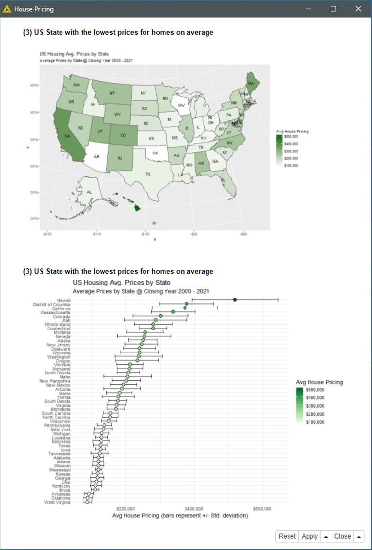
Q3.- To answer the easy question, I just took the opportunity to design a very intuitive qualitative dashboard with R. The answer by the way based in my data is West Virginia (WV).

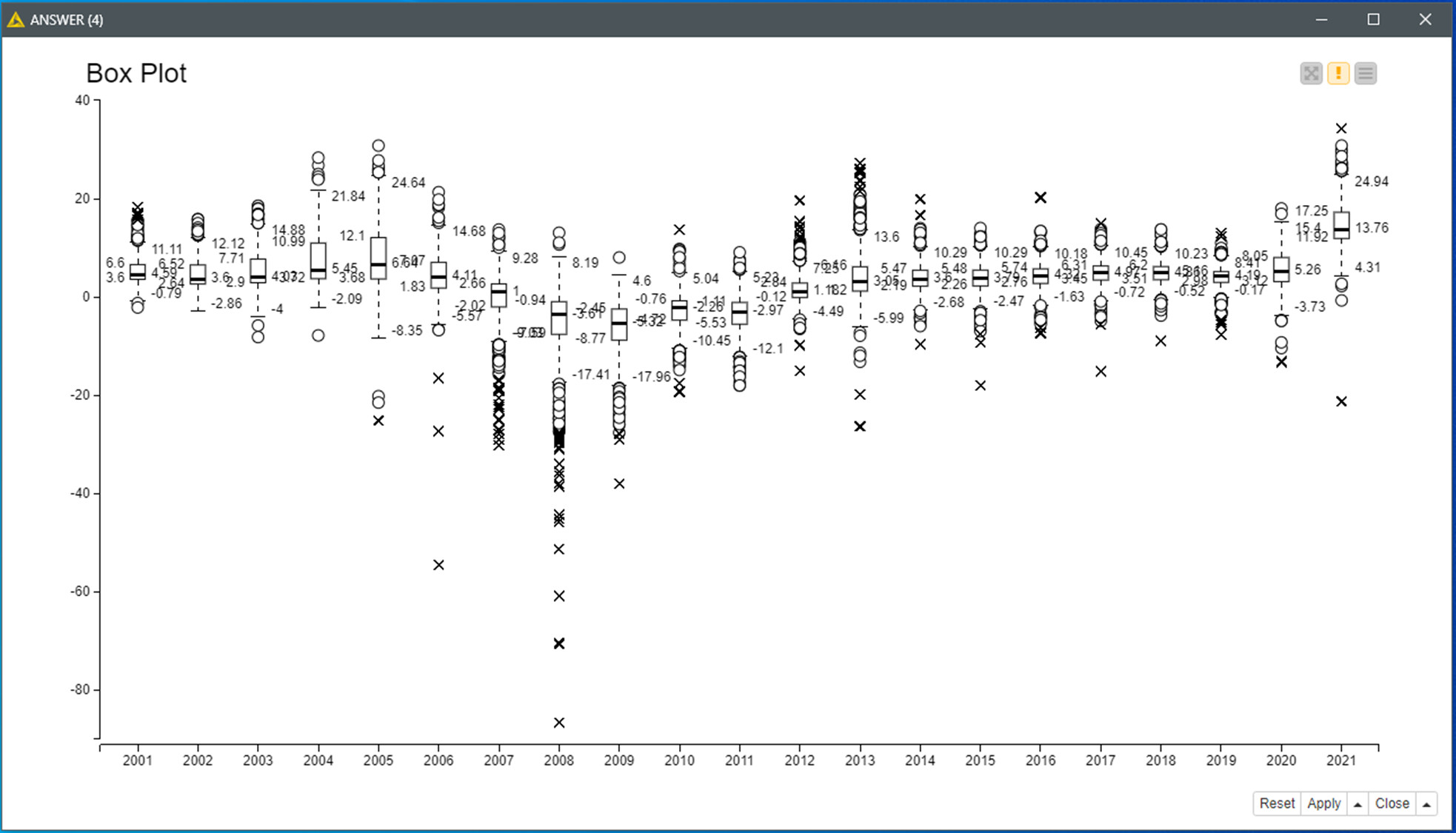
Q4.- Despite it can be explained based in Q2 visualization as suggested in the challenge description; I’ve tried a different busy one with the percent (state max) price evolutions, aiming to highlight the drama.

BR

4 Likes

I found an error on Q4 description:

For this visualization I am currently using ALL year’s closure percentage variations Regions data. ‘(State max)’ isn’t just correct.

BR

1 Like

Amazing work @gonhaddock !!

The trend line shows exactly when the pricing crisis started for each case close to the end of 2008. Normalizing the data surely tells the story in another way. And the final boxplot makes all more evident. :ok_hand: :clap:

2 Likes

Thanks for resuming your participation in our challenges! We see it and appreciate it! :smiling_face_with_three_hearts:

2 Likes

I love it when the story changes depending on how you preprocess the data (which can include normalization). Data analytics always needs to be taken with a grain of salt AND with a lot of context.

2 Likes

This topic was automatically closed 90 days after the last reply. New replies are no longer allowed.