This thread is for posting solutions to “Just KNIME It!” Challenge 27. This week we go back to data extraction and data visualization to tackle a problem on rare blood types.
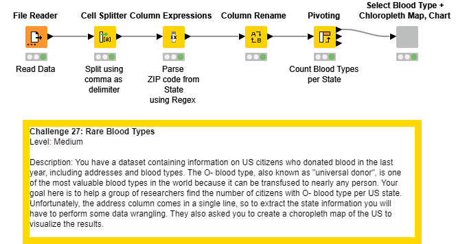
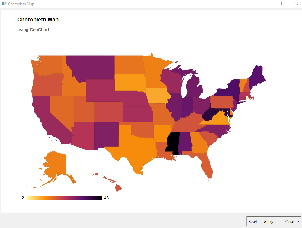
Here’s my solution to the JustKnimeIt Challenge 27. Just created a single component in the end to visualize both the results & map. justKnimeit-27-Chloe – KNIME Hub
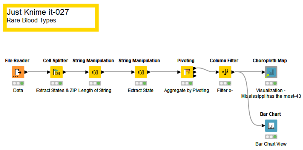
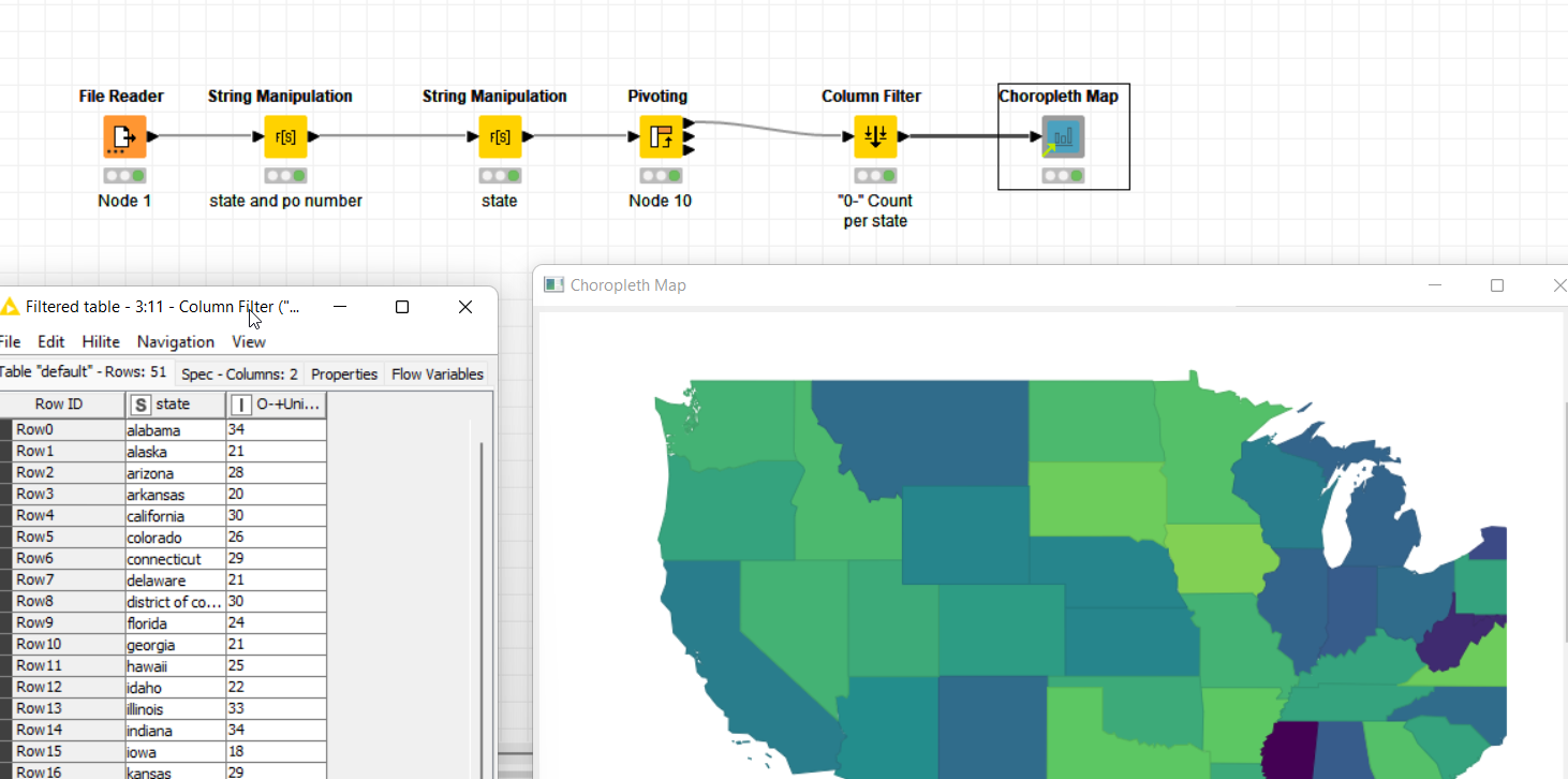
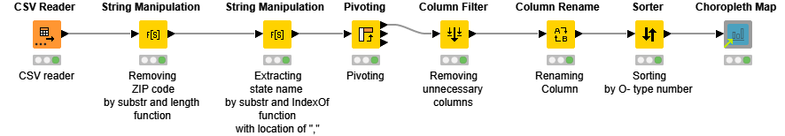
I have realized a very small workflow, just to answer to the problem (so nothing fancy or added for visualization part).
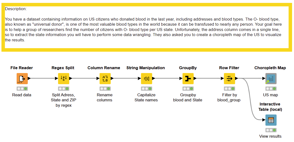
But I am very happy, as this was a good opportunity for me to realize a good (at least working) Regex expression to efficiently split adress ! I have spent some time on regex101: build, test, and debug regex to be sure that my expression would work on entire dataset
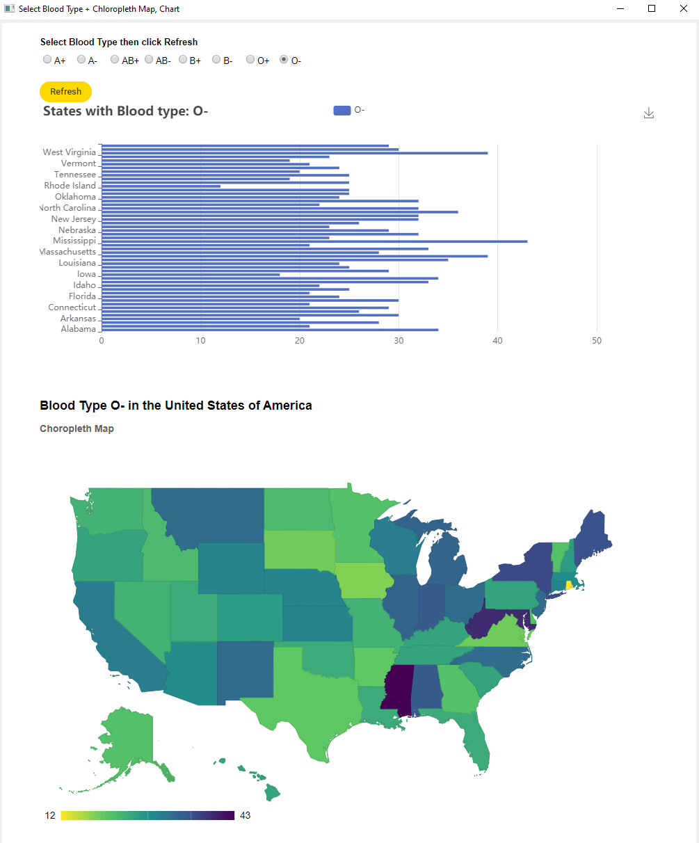
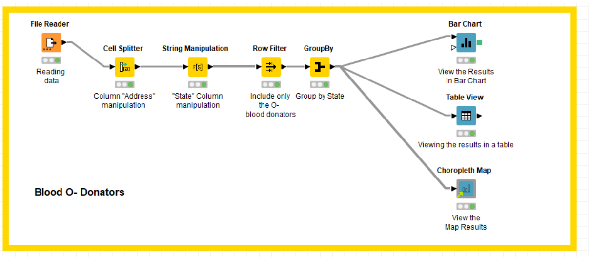
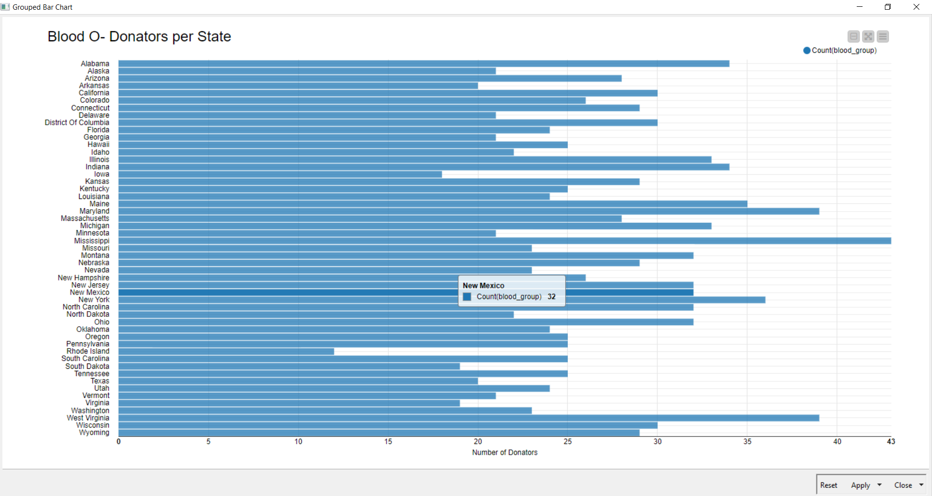
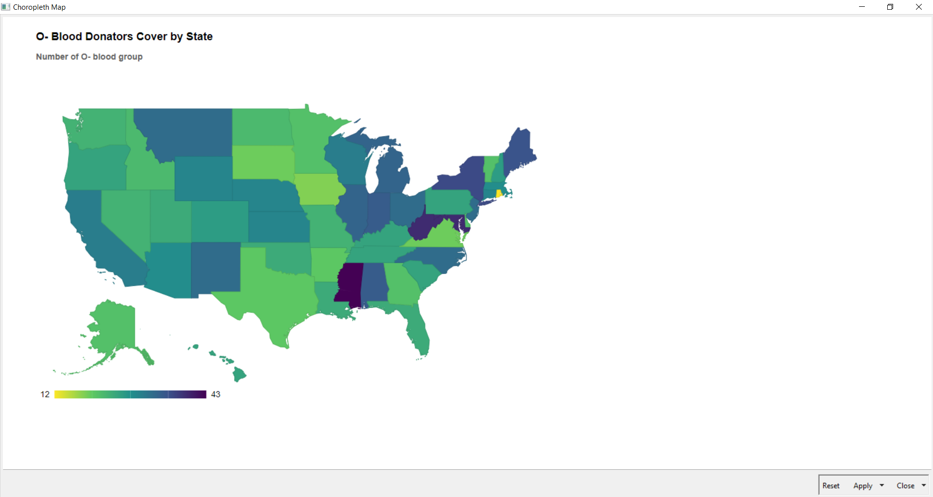
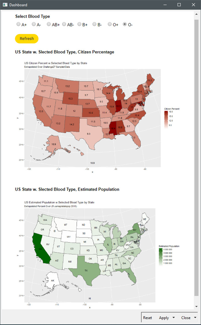
I used the Chloropleth Map and Bar Chart Nodes and made it into an Interactive Dashboard using Column Selection and Refresh Widget Node, now user can select the blood type, press refresh and it’ll show the results and changes into the dashboard without having to reset the nodes in the workflow
I took the selector and refresh button cool idea from @si_daniel_a
I’ve recycled ‘R’ US Chloropleth Map from my Challenge 17 . And representing in parallel 2 maps:
A quantitative display of sampled percentage by State (red color scale); with MS, IN and MD above 18%
A qualitative extrapolation of the percentage over population (green color scale); estimating number of citizens with selected (O-) blood type per US state. CA and NY with higher number of individuals owning targeted blood type.