Table View node - allow it to be set to "Compact Rows" mode as the environment default

In KNIME AP 5.1, the absence of the Classic UI’s ability to view the output data ports in pop up windows almost certainly means that I will now find myself placing the Table View nodes at various points in order to be able to see the output from different nodes at the same time. When I first started using KNIME, just two and a half years ago, the ease of viewing data from multiple nodes concurrently was one of its stand-out features. When I was using Alteryx, for the couple of years prior, I had to drop “Browse Tools” onto the canvas to view node output, and whilst I got used to it because there was no alternative, I found the KNIME Classic UI approach to be far more efficient and productive.

I hope that capability returns in 5.x but in the meantime, if I am to use Table Views, then I want them to be as efficient as possible.

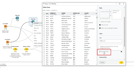
By default, the Table View node places a large amount of white space around the data. It is perhaps pretty and for some, more readable, but I would prefer it to be more efficient. To that end, it can be configured to show “compact rows”…

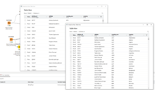
This screenshot shows the difference between normal and compact in KNIME AP 5.1

Personally, I would prefer to be able to have it set to compact mode all the time, but I realise this may not be to everybody’s taste. The ability therefore to either toggle between “compact” mode and “normal” on the view itself (i.e. on the display that is opened with F10, rather than having to open the configuration dialog), and/or the ability to set it as a default for the local KNIME AP environment would be a welcome addition.

(Notwithstanding the above, I would still add my vote to being able to open a table viewer directly from the output data ports though as per Classic UI, and to allow the 5.1 data viewer panel to be completely closable. Working with multiple displays means I would rather have my workflow on my primary monitor, and the data viewers on my laptop screen, or other secondary display. I don’t really want to have to litter my workflow with Table View nodes in order to achieve this)
Just a side recommendation. You might try using the Interactive Table (local) (now labeled the “Interactive Table (legacy)” node) instead. It has a window setting for “always on top” which makes it accessible for copy and paste while working in configuration windows.

I prefer the more compact views as well.

2 Likes

Thanks @iCFO . Great tip.

I’d not seen that node before (never needed it I guess) and that is definitely better suited to my use case. Plus it has the ability to write to csv, which is something I’d long thought would be a useful feature of any viewer. I wouldn’t normally actively start using a node described as “legacy”, but in this case I feel I will need to make an exception. :slight_smile:

1 Like

I am really hoping that it is only labeled “legacy” because they are working on a newer version or dedicated UI window. It is the only node that I have found which allows access to copy and paste data while working in a config window. This node is definitely toward the top of my essential list. I use it constantly in conjunction with a “Formula Values” component on my public hub, which gives a unique value list / column name / data type ready for copy & paste into expressions.

In fact, I would have a hard time working at all without this node right now. Just had surgery for a torn bicep, so can’t type with my left arm. Between this node allowing direct copy and paste into expressions via mouse buttons, and a few custom Java / Rule Engine voice commands in Dragon dictation pro I am probably working just as fast or faster.

@ScottF - Are there plans for replacing the Interactive Table (legacy) node functionality on the UI side, or with a new node?

2 Likes

Hope you make a speedy recovery @iCFO

2 Likes

Hey all,

there are some very interesting and valuable points in this thread. Let me quickly summarise and comment on the different points:

  • Would be useful to have the compact rows settings as global setting: I agree and will check with the devs and see what we can do
  • Changing the compact mode on the fly in the table view itself: Would this really help? I personally wouldn’t like to change it all the time when I open the view.
  • Re-introduce the capability to pop-out table view from output ports: I agree and we are currently investigation on how we can make this possible.
  • @iCFO what do you mean with “It is the only node that I have found which allows access to copy paste data while working in a config window”? I assume you mean copying content from different cells at once? We are currently investigating how to enable this feature in the new Table View node. Is there anything else that makes this node better compared to the new Table View node?

This node is marked as (legacy) as it is based on some old technology which makes it hard for us to maintain it. The replacement in the future should be the new Table View node, so lets try to find all the things that this new node is missing compared to the other to be a good replacement for this node.

Greetings,
Daniel

2 Likes

Thanks @DanielBog ,

Re the ability to switch compact mode “on the fly”… no that isn’t too important to me. It was only a thought for making it simpler if the ability to set a global default wasn’t available. I’d prefer it compact all the time, but others may not!

Good to know that the idea of reintroducing pop-out table view on data ports is being looked at too.

1 Like

Hey @DanielBog ,

I actually have a zoom call scheduled with you and Peter scheduled for Thursday, so I can do a quick demo of how I use this node and a few ways you might be able to incorporate the functionality into the new UI.

The short summary is that the functionality which is critical is the “always on top” setting of the window. I would much prefer to have this built into the UI, however it needs to be available for any node output (not just the one currently selected) so it would need to be built into the output port windows of individual nodes and not just allowing copy / paste from the Node Monitor window during configuration. Although that would be a nice feature as well.

Another idea… Perhaps this could be done the other way of not locking users into the config window during node configuration?

I also agree that I personally would only need a global setting to view tables with compact rows.

1 Like

Hi @DanielBog , I have been trying to work more with Modern UI, but I have realised that the ability to view the data efficiently is probably the single biggest factor preventing me using Modern UI in the day job.

Aside from the additional functionality issues that @iCFO mentions and uses, purely in terms of visual efficiency, I thought I should highlight what it is about the classic data viewers that make them much more efficient for me. I’d really like to be able to move to modern UI day to day, so I hope this feedback will be of use.

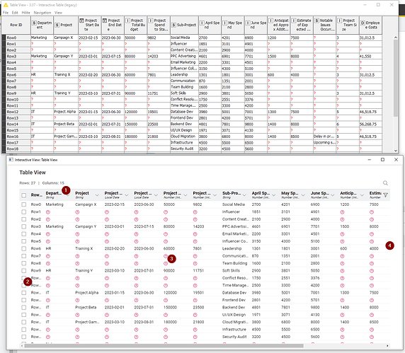
Here is the same data being shown from the same workflow in AP 5.1 The top is the Interactive Table (legacy) node, and the bottom is the Table View node (in “Compact” format):

The numbers relate to the following notes:

(1) The heading ideally needs to be the same size font as the data. I see no reason why it needs to be made larger. It is clearly the top row and it can be differentiated by colour if need be, rather than by size. Making it larger simply reduces the ability to read it without widening the columns. Unlike the legacy node, there is no ability to wrap the headings, so to read all the columns in the Table View above, I would have to manually widen every column.

(2) The RowId column as standard is not wide enough to tell me any row number above Row9. I have to widen it every time I want to view it.

(3) I find the red circled (?) much “louder” than the classic counterparts. In classic, my eyes are drawn to the data. In modern, my eyes are drawn to the “missing values”. This is possibly just a personal thing, but I’d welcome the ability to change the style of the marker

(4) Modern UI does not display as many columns in the same screen width. In the above comparison Classic has three more columns displayed than Modern, without using any more desktop area.

I can see that Modern viewer may have the ability to provide some greater functionality in future, but it needs to not lose the visual efficiency of its classic counterpart in the process. The Interactive Table (legacy) node is the only way I can currently work with data output within a similar efficiency that I get in classic, but having to drop them on the workflow significantly negates that efficiency.

I am grateful for the amazing work the KNIME team are doing with taking the platform forward, so I look forward to the re-inclusion of being able to view output ports directly on the workflow in a more visually-efficient format.

1 Like

Hey @takbb,

thank you for your detailed feedback. This is super helpful and I fully agree with your points.
We will be looking into these issues and I will update this thread as soon as I have news on any of these points.

Thanks again for the feedback and I would be happy if you give it another try as soon as we have tackled the issues.

Greetings,
Daniel

2 Likes