First, thank you guys for answering questions quickly, most appreciated ![]()
We have time series data for trading. It contains (1) a column with the price (double) and (2) a column (integer) with indicators for buying (1), selling (-1), or staying in position (0). We know that the price can be visualised as a line using a Line Plot node. But what we need is for the same plot to also highlight clearly the days with Buy/Sell indicators.
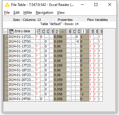
For instance,

Here the columns Price and Indicator are highlighted. We could use Line Plot with x axis set to “Date” and y axis, but the Line Plot node is not suitable for showing the buy/sell indicators. We were wondering which view node can show the price on each day and also the indicators Buy (1) on 11 Jan 2024 and Sell (-1) on 23 Jan 2024. For example, overlay a circle on the price line where the indicator =/= 0, eg green on 11/Jan and red on 23/Jan? Would a scatter plot help or do we need to overlay two views?
Many thanks