Hi, sorry for my english, I need to to do a bar chart with this data-set.
My idea is to plot four bar graphics in one single image, where the first plot represent the first categories and the frequency of the answers, and same graphics for the second, the third and the fourth categories.
Thanks for the help
Hello @violandre01
Could you provide some data? so It’ll be easier for others in the forum to help. In the picture we cannot even see the column headers; ‘view >> wrap column header’ in table options is great for that.
Meanwhile, you can download and explore the solution to #justknimeit-8 , you may find similarities to your challenge:
You may consider to work with the ‘Histogram’ nodes as well, as they can perform the counting on string items.
BR
3 Likes
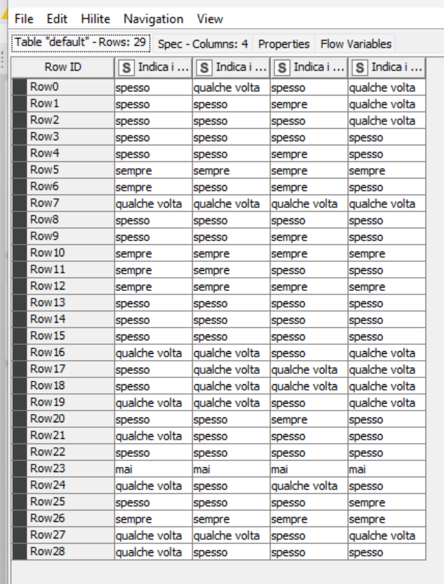
I thanks for help me, this is the dataset
prova.xlsx (9.3 KB)
Hi @violandre01
Please have a look to this workflow, these are just the basics.
20220928_bar_charts_2.knwf (80.1 KB)
In the current chart you can deselect the questions by clicking on the colored legend. Otherwise I aggregated a column filter for sending only the question that you want to display…
Some more automatization can be done to be incorporated within a ‘Component’, but we don’t know about your use case.
BR
4 Likes
Thanks for the help.
Do you think it’s also possible invert the graphic? For example in the x-label the questions, and in the y-label the frequency of an answer? I ask you this as the questions are cathegories and I don’t know if KNIME allow this.
1 Like
@violandre01
Do you mean like this:
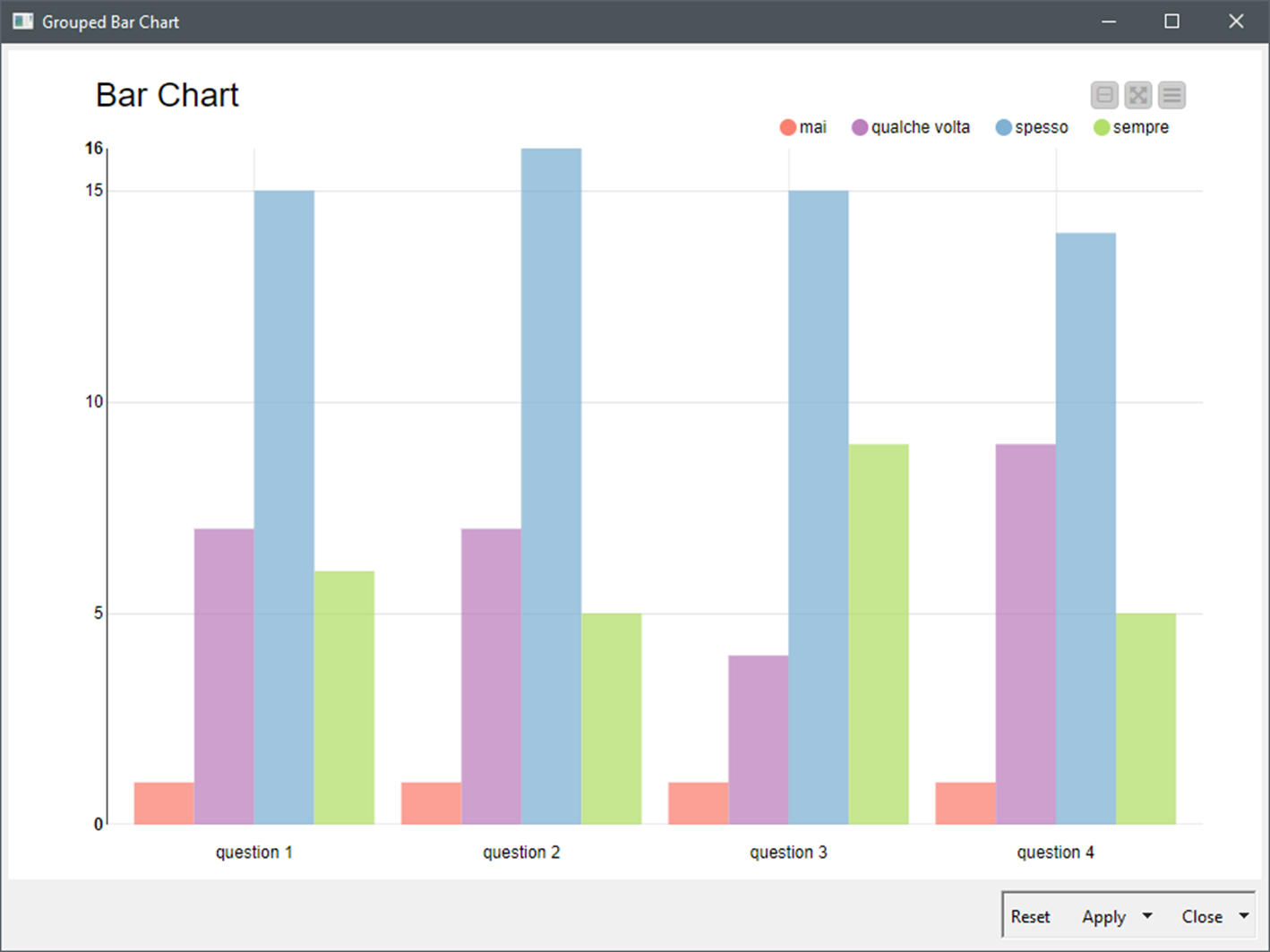
20220928_bar_charts_3.knwf (125.4 KB)
You can flip the axis and make it horizontal as well in ‘General Plot Options >> Plot horizontal bar chart’
BR
5 Likes
Okay, you just save me.
Thanks for all!
3 Likes
This topic was automatically closed 7 days after the last reply. New replies are no longer allowed.