Hello everyone.
I need your help to create a dashboard. This is the first time i am trying to create the dashboard in Knime. i do not want to use any other tool like Power BI or Tableau in order to learn to to rely 100% on Knime.
I have created quite a few pie charts, bar charts, scatter plots (matrix) as well as one Geospatial view and one Kepler.gl Geoview along with two table views.
(1) Is there any way to adjust the width of bars in a bar chart in individual charts as well as the font size of the labels? i cannot find any formatting for colors for different bars unless i use Color Manager node. Is there any way i can adjust the colors with in the node instead of adding additional node “Color Manager”?
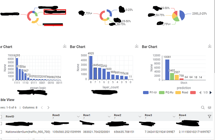
(2) in the individual bar chart output the bars are not starting from the Y- axis but there is some space as can be seen in the screenshot with red rectangle. This aesthetically looks quite odd. how can i get rid of this space?
My second issue is to create the dashboard. I am selecting all the required bar, pie charts and forming a component. when i click on “open layout editor”, and try to select the layout with three pie charts at the top and then two rows of two bar chart each and then one row for two Geospatial views, it does not close the window when i click finish. Even if i reset the layout and bring it back to its original form and clock on “Finish” it still does not work.
please find attached the screenshot of a basic level of dashboard i have created. This looks quite unprofessional with this big font size and layout. i cannot even create border around the charts.
In addition i want to get rid of the grids in the bar charts if there is any way to do so.
My apologies for this messy black paint as i had to hide some information for it not to get into public domain
thanking you in advance for your kind help and support

