Hello there,
I am working on some graphs, but I think what I am trying to do is a little bit complex, and I am not really sure if Knime supports this kind of graph.
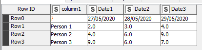
This is an example of the data that I want to represent on the graph:
The y-axis should reflect the Column1 values and x-axis will reflect the Row0 values (Row0&Column 1 cell should be 0)
The numbers for each combination of the x-y combination cells should be shown as a point on the graph, and then those points should form a line (per row)
I hope I gave a clear picture of what I am trying to do.
Is that possible to do in Knime? And if yes, could you please advise which node I should use?
Hi @ScottF,
Thanks a lot for your response, it really helped, i just had to Transpose my data.
Although now I have another issue similar to what was mentioned on this topic:
Eventually, is there anything else (apart from using the Generic JavaScript View node) that can be done for such a case?
Thanks a lot @ipazin
The issue you provided as an example could actually help, i can see several changes reflected, like when i change the size of the letters or the color etc, but the rotation does not work…
I tried many different ways, but still the labels are not getting rotated…
Additionally, i can see that there is a customeCSS field in the flow variables for the Bar chart, but not for the Line plot…
Any advice on these?
some “plot” nodes do not support CSS styling. Line Plot node for example. But there is KNIME Plotly extension featuring Line Plot (Plotly) node that supports it so give it try.
And about rotation you can share workflow with your CSS and plot so I can check but no promises there
Hi @ipazin
Thanks a lot, I will give it a try!
As for the CSS, I have attached this part of my workflow.
Much appreciated either way! Charts test.knwf (9.0 KB)
I just tried to use Plotly node for the same flow, but it also seems that the CSS changes are not reflected either
But there is a small improvement:)
I am attaching the new workflow below Charts test.knwf (11.9 KB)
unfortunately Plotly extension does not support current KNIME classes. But it automatically resizes and rotates labels so it should work better, right?
And Bar Chart does work but needs more playing time to make it better. Honestly when I remember using CSS on university never really liked it much
Hi @ipazin,
Plotly does not resize the labels automatically… Unless something different should be done… I can still see that the labels are being cropped…
So if I understand correctly there is no way to get the labels fully displayed on any of those charts?