Dear Knimers,
I am currently facing (another) issue with k-Means optimization with Silhouette Coefficient.
I have the following file:
Art_I_clustering.csv (462.8 KB)
I tried to use the suggested component for k-Means optimization: (Optimized K-Means (Silhouette Coefficient) – KNIME Community Hub)
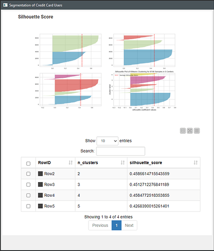
Besides, I also tried (in a parallel comparison), to apply a simplified version of loop for optimizations, with and without normalization. I wished to test the accuracies of such schemes. This way, I got four (parallel) k-Means algorithmic clusterizations, as in the following screenshot (at the left, using the component without (above) and with (below) previous normalization; and the simplified version of loops for optimization, once again, without (above) and with (below) previous normalization:
Finally, my question is:
I got four graphs, and the recomended k number is:
a) for both the non-normalized component AND the simplified loops, the k was 6;
b) for both the normalized component AND the simplified loops, the k was 5.
Both graphs were remarkably different one another, as if they were depicting different realities. Those graphs are in the following (*.DOCX) file:
Graphs for k-Means optimization using component or simplified loops with or without normalization.docx (201.0 KB)
I ask for someone help me to understand – and to explain such difference, because I am drafting a paper whose goal can be better achieved (accessorily) using one clusering technique.
If any other Knime Community member could help me to choose the most correct option and to present a better argument to explain the differences, I would be most grateful.
Best regards.
Rogério.

